Fickle Friends have released a video for “Brooklyn.”
Fickle Friends – “Brooklyn” Video


Fickle Friends have released a video for “Brooklyn.”

The Politics & Prose Bookstore have posted up the video of Laura Jane Grace’s recent book signing and Q&A session. You can stream that over at Facebook or below.
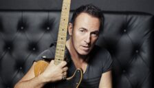
Bruce Springsteen has extended his book tour. The additional dates can be found below.

Father John Misty’s new track, “Holy Hell,” can be streamed below.

Green Day performed “Bang Bang” and “Revolution Radio” on Kimmel last night.
The Fat Wreck Chords documentary, Punk-U-Mentary, was released today. An exclusive clip from the film where Fat Mike describes signing Strung Out to the label can be found below via Brooklyn Vegan.
Coldplay have announced they will be releasing the Kaleidoscope EP, featuring new songs, in 2017.
Guttermouth have released the new song, “The Human Mulligan,” from their upcoming EP.

Malia Wollan, writing for The New York Times:
The team of color scientists hovered in their white coats and hairnets, staring down at a clear plastic box full of strangely colored M&Ms. “They look like pebbles, ugly little pebbles,” said Rebecca Robbins, the color-chemistry manager for Mars Chocolate. She propped open the lid to show off a muted array of gray, tan, mauve, pale purple and sickly pink chocolate nuggets. Each attenuated shade was the disappointing outcome of an early attempt by Mars to replace a bright, artificial dye with natural pigments extracted from algae, roots, seeds and other parts of plants. Not a single piece of candy in this tackle box of failure looked edible — let alone tempting.
Regina Spektor has released her video for “Bleeding Heart.”

Pierce The Veil have released their video for “Dive In.”
Almost Normal have released their new video for “Young Forever.” This song is the first single off of the band’s upcoming EP, Mantra, which will be released in January of next year. This Las Vegas alternative duo has a dark and atmospheric vibe that feels right up the alley of most of our listeners. Hope you enjoy!
If you like the song make sure to also grab it on iTunes.

The notable bands on your television this week include: Green Day (Kimmel; 11/21), Halsey (Kimmel; 11/22), The Killers (Kimmel; 11/22), Ok Go (Colbert; 11/23), Green Day (Corden; 11/22).
A Tribe Called Quest have the number one album in the country this week.
The set, which was released on Nov. 11 through Epic Records, earned 135,000 equivalent album units in the week ending Nov. 17, according to Nielsen Music. Of that sum, 112,000 were in traditional album sales.
Alt Press talked with Nicholas Prior, the photographer behind Brand New’s The Devil and God… artwork, to discuss the photo ten years later:
I don’t know specifically how the band first came to see the image. The band presumably first saw the image at my solo show at Yossi Milo Gallery in New York City. I assume there was one person who made the first suggestion to use it, though, and I don’t know who that person is. The band didn’t reach out to me directly; rather, Interscope Records (Universal Music Group) contacted my gallery, so there were several intermediaries involved. Originally, when Yossi first told me about the offer—and before I even knew which band was behind the request—I declined. The band was very committed to this image, though, which meant something to me, so I asked a few more questions—chiefly, about which band was behind the request, and their intended treatment of the image. Interscope sent me an advanced copy of the album, and listening to it clearly sealed the deal. I agreed to cropping the image to a square, but I didn’t want any text on the cover which, I think, makes the cover much more compelling and intriguing—though it did seem to confuse David Letterman.