As I’ve been spending some time bringing back some of the old AbsolutePunk reviews, interviews, and diving into my musical history via the “My Nostalgia” and “Back to…” series, I’ve been compiling pieces of the AP.net history together with things I’ve had in folders on my hard drive over the years. I’ve been able to piece together screenshots of various quality from quite a few of the years, and figured putting them online with commentary about what I remember from each “design” would be a fun way to preserve some of that history. Unfortunately so much of the early years is lost to time. I never even thought to keep archives.
1999
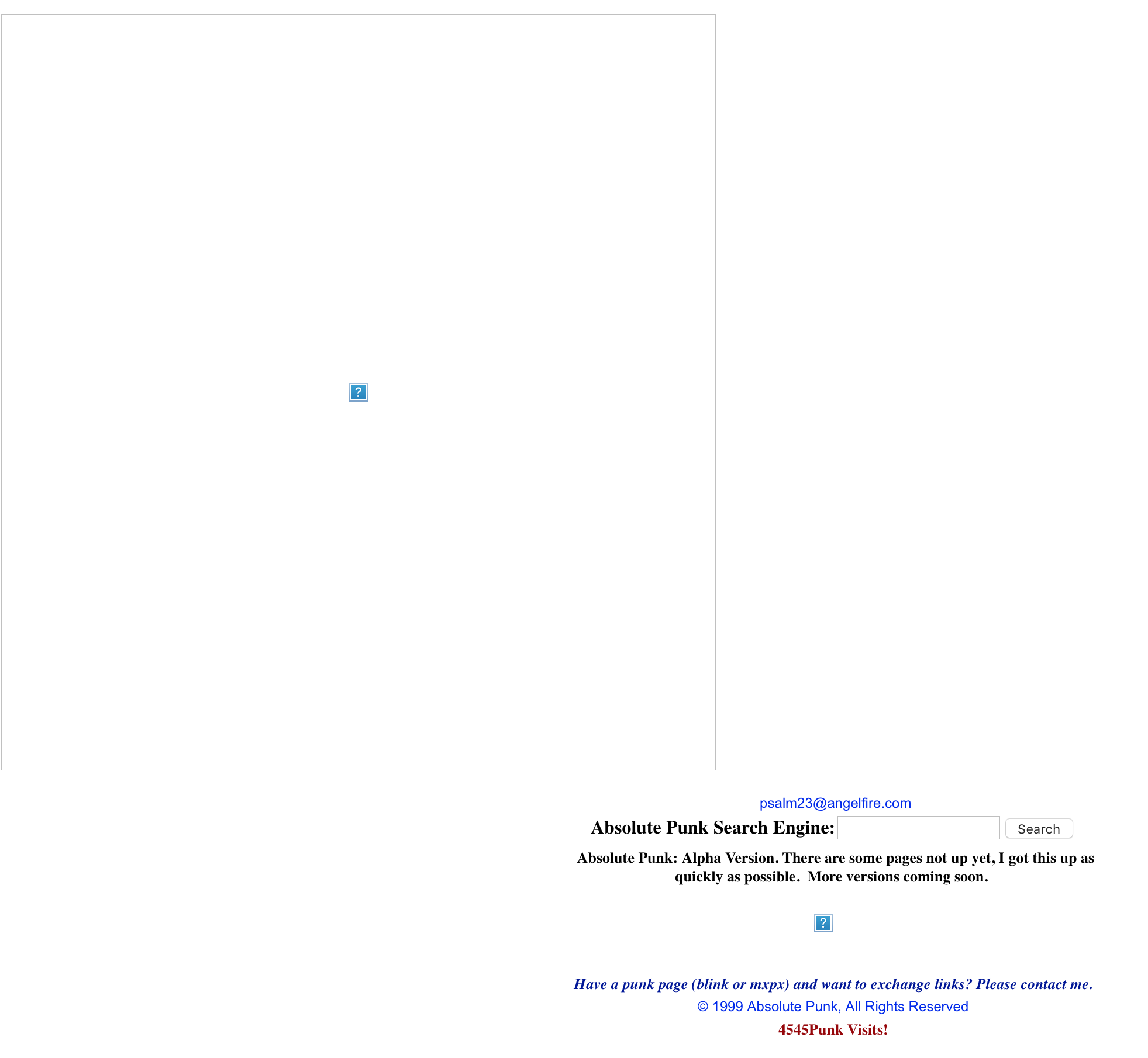
The first thing I can find that was using the AbsolutePunk name was from either very late 1998 or early 1999. I’m not exactly sure when it went up, but I called it an “alpha” version and was using the first email address I remember setting up for myself. Unfortunately none of the imagery works, and at the time the only thing I knew how to do was create designs using image maps, so, I have no real idea what this looked like.
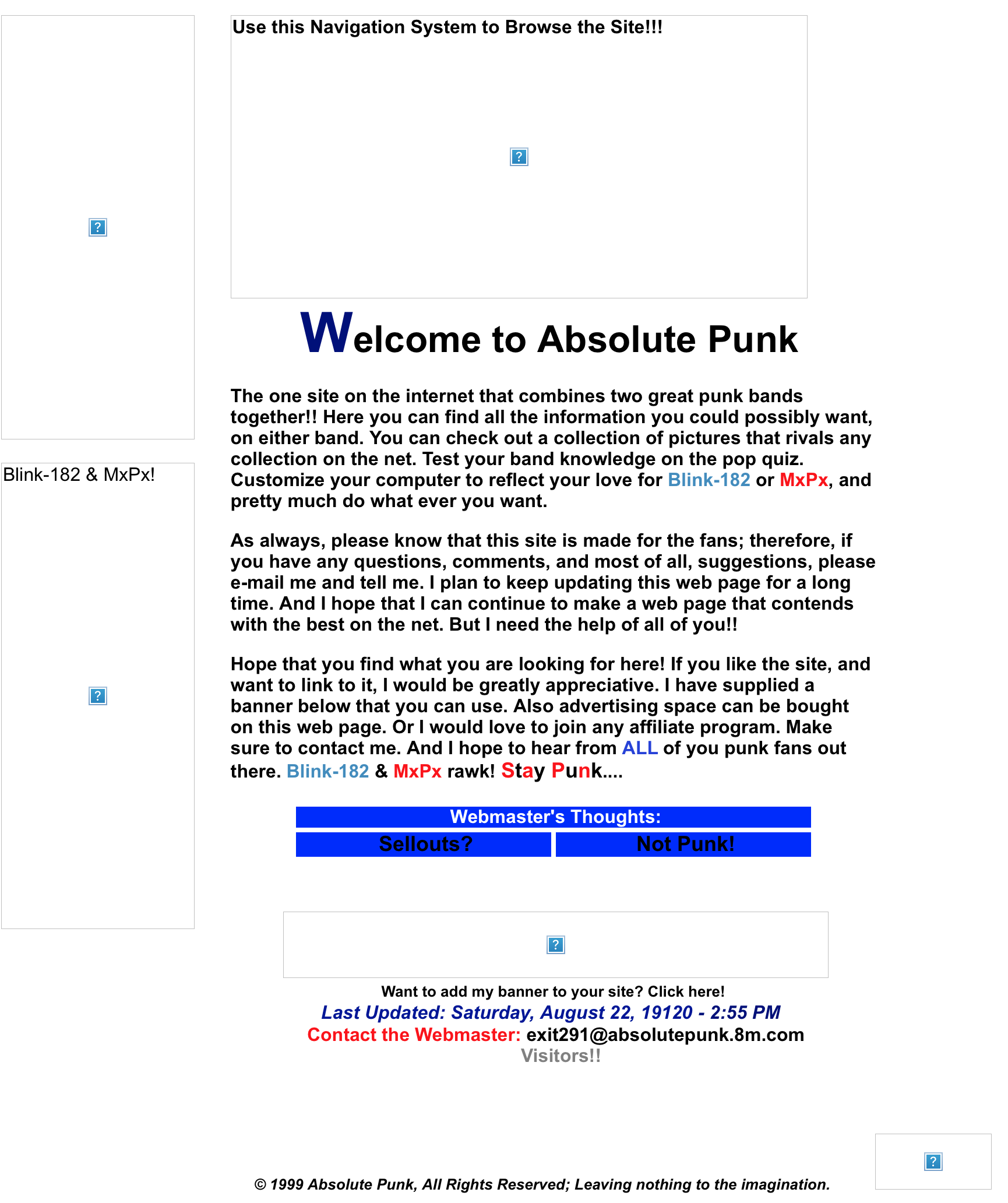
But not long after that comes a design with more text, and some hilariously bad copy. Sure, I was 16, but that’s no excuse to keep typing “Stay Punk” on the internet.
I was changing “hosts” like I changed my clothes. I moved the website away from Angelfire and started using a free domain service from 8m.com. This version of the website is where I first started actively updating the website with news and various features. I had desktop wallpapers, AIM icons, a discography page for both bands, lyrics, and weird trivia about the bands.
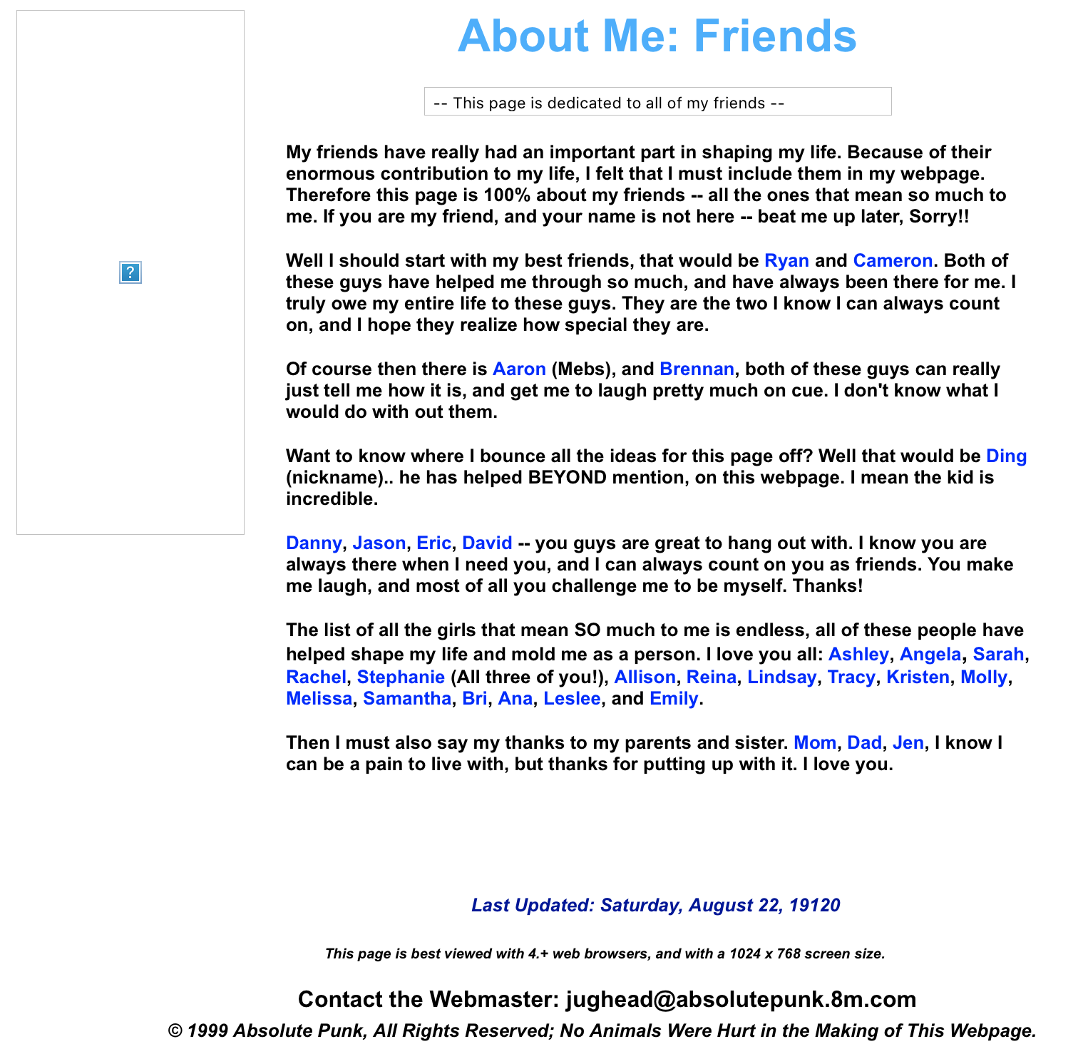
For some reason, I also had an entire section devoted to my friends. The early internet was weird. All of these “sections” and pages are individual HTML files that I was manually uploading over FTP.
2000
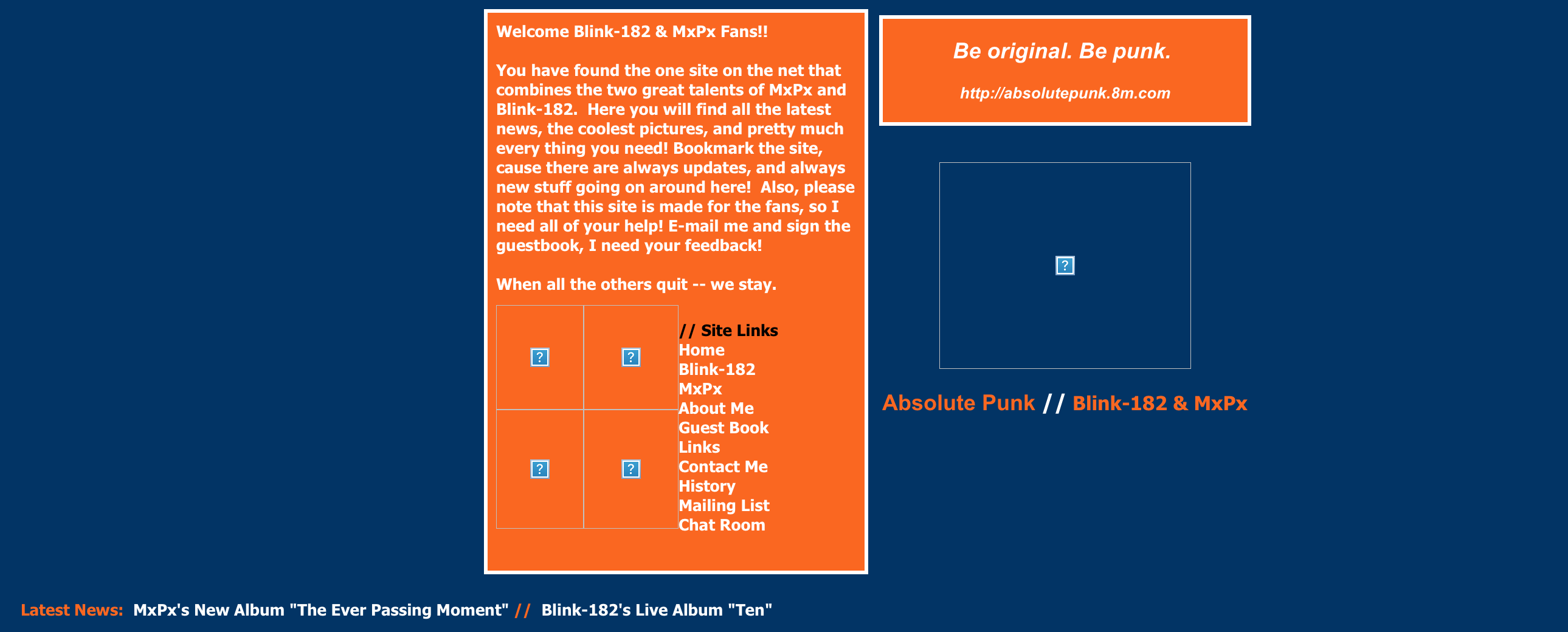
These early years led to me getting bored and changing the entire design of the website on a whim. I’d just decide one night that I felt like making a new website and start playing around with colors and tables and toss something new up. There was an orange and blue version for a while:
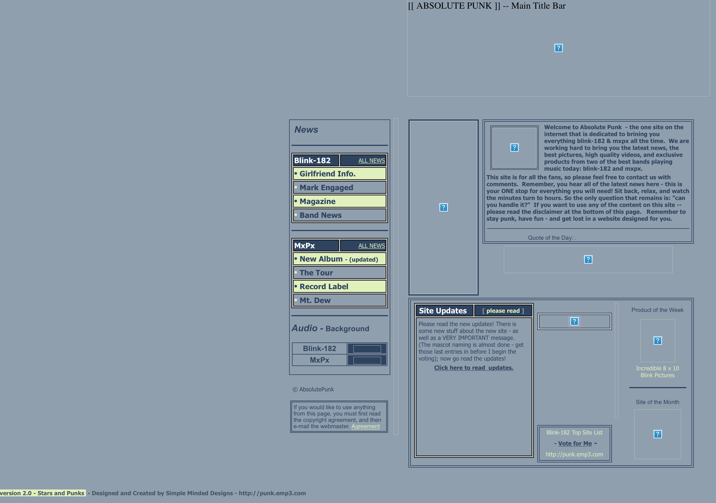
And then there was what I was apparently calling a “Stars and Punk” version of the website. (I am pretty sure I was using a star as the logo for the website at this time.) I actually still kind of dig this color scheme:
There was also the phase where I’d get sick of the current website design and yet not be done with the “new” version of the website, so I’d throw up random splash screens with news for a while. None of these are using any kind of database yet.
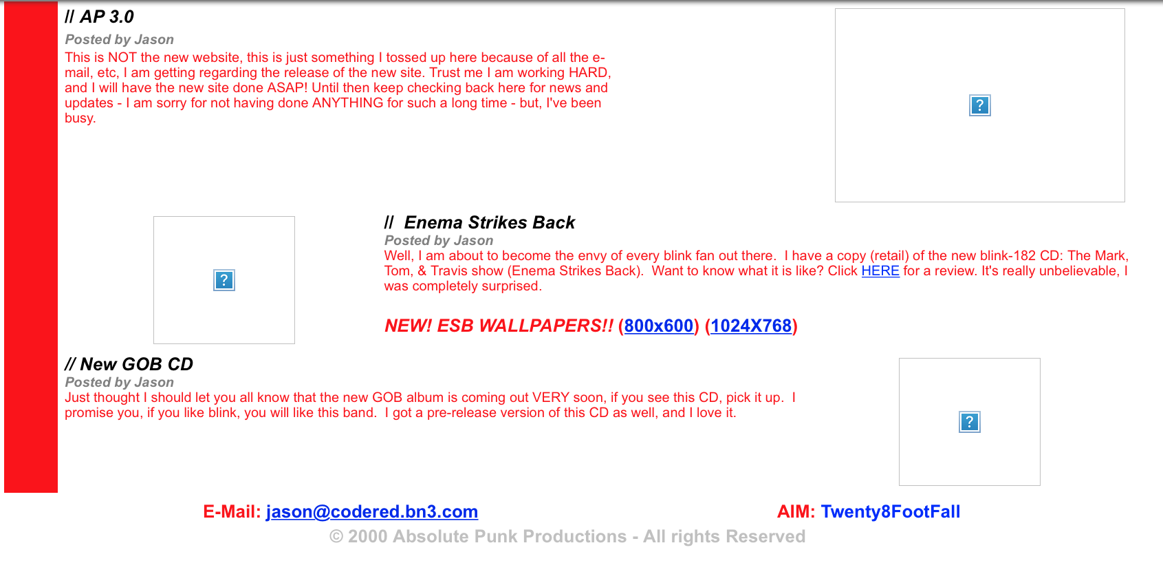
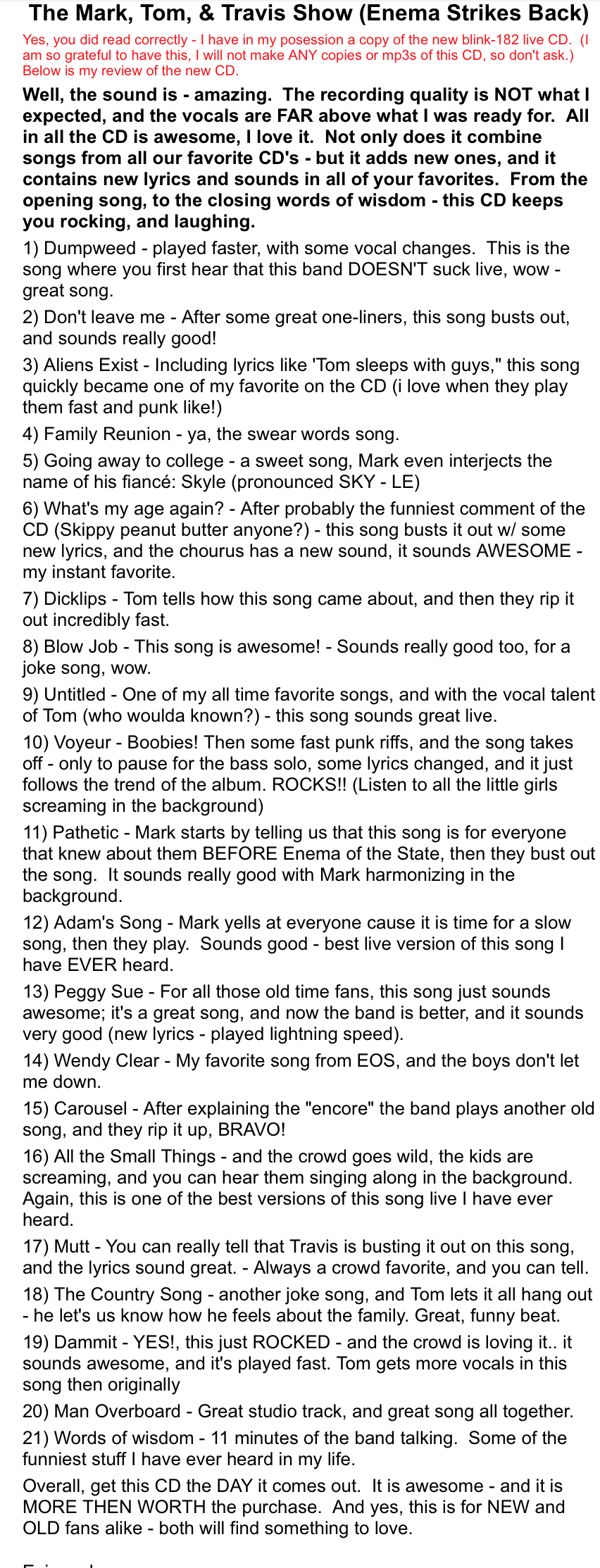
That Enema Strikes Back “review” has to be the first review I ever posted on the internet. There had been news sections on virtually every version of the website, and the early pages also had a “history” section that was full of the dramatic ramblings of a 16 year old maniac with some of the … worst … punctuation … and … spelling … ever put onto the internet. It was basically a blog before I had ever even heard the word blog. Oof, and it’s not like the “review” is better. Fine, you can read it.
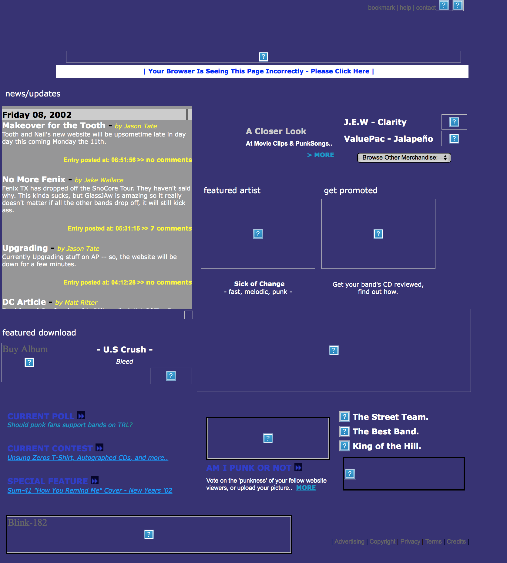
2001 – 2002
The period from 2001 to 2002 is when I transitioned the website away from a Blink-182/MxPx page into a more general “punk” music page. None of the images work, so it’s really hard to get an idea of what this layout even looked like, but from memory I was ripping off the old Launch.com design. I mean, the color is almost an exact copy.
This is also the stage where I finally had a backend to update the news section of the website. It was using the very early blogging software called Graymatter. I had no idea what I was doing, but I loved that I could update “news” by typing in a box and pushing “publish.” No more hand coding and uploading HTML files.
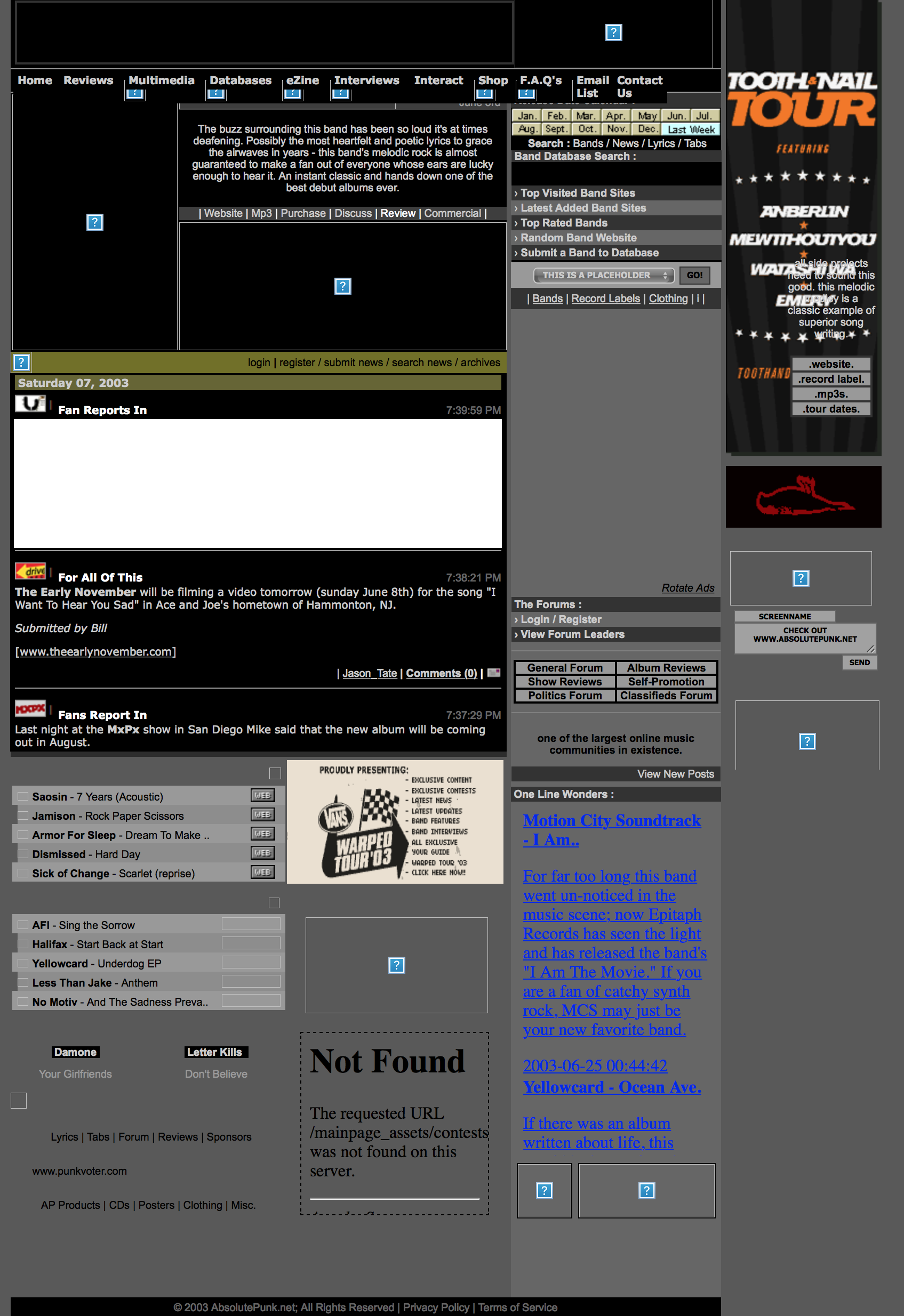
2003
It wasn’t long before I got the urge to change up the design again. And this phase is actually one of my most beloved memories of the website. I designed and coded the website from my college dorm room, and this is the first time the AbsolutePunk heart logo makes an appearance. The design started with this army green looking color (again, hard to get a great look at it due to so many images being missing):
And then I started using the dark red color that would end up becoming synonymous with virtually every design of the website from that moment onward. The heart logo and “music mends broken heart” tagline are out in full force. I sure loved those “blood” Photoshop brushes.
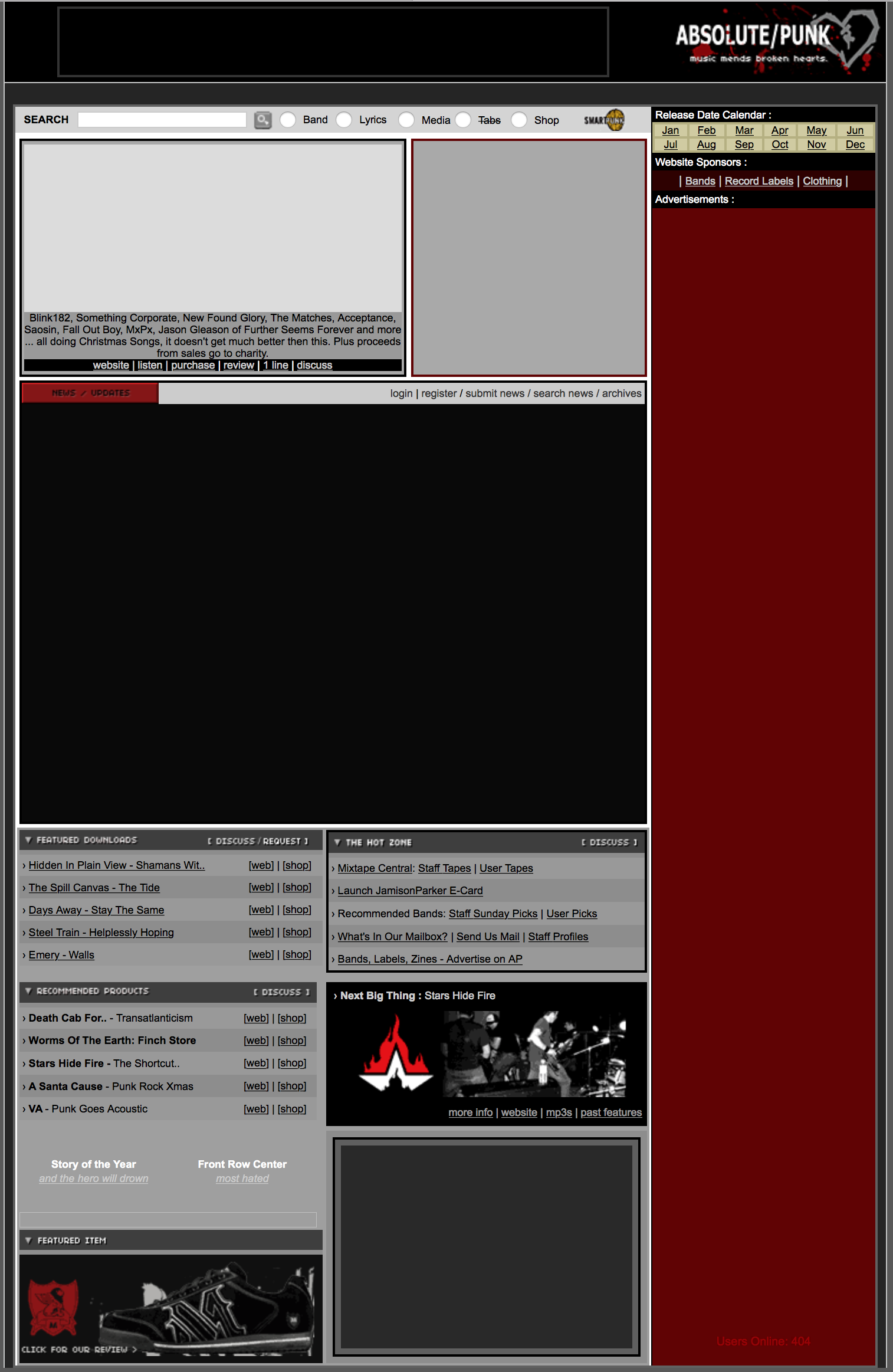
All in all, I think this one holds up pretty well. I have a lot of memories of working on this version of the website in college.
2004
The next big design change lightened everything up. This consistent trend of putting all the news in a scrolling frame was interesting.
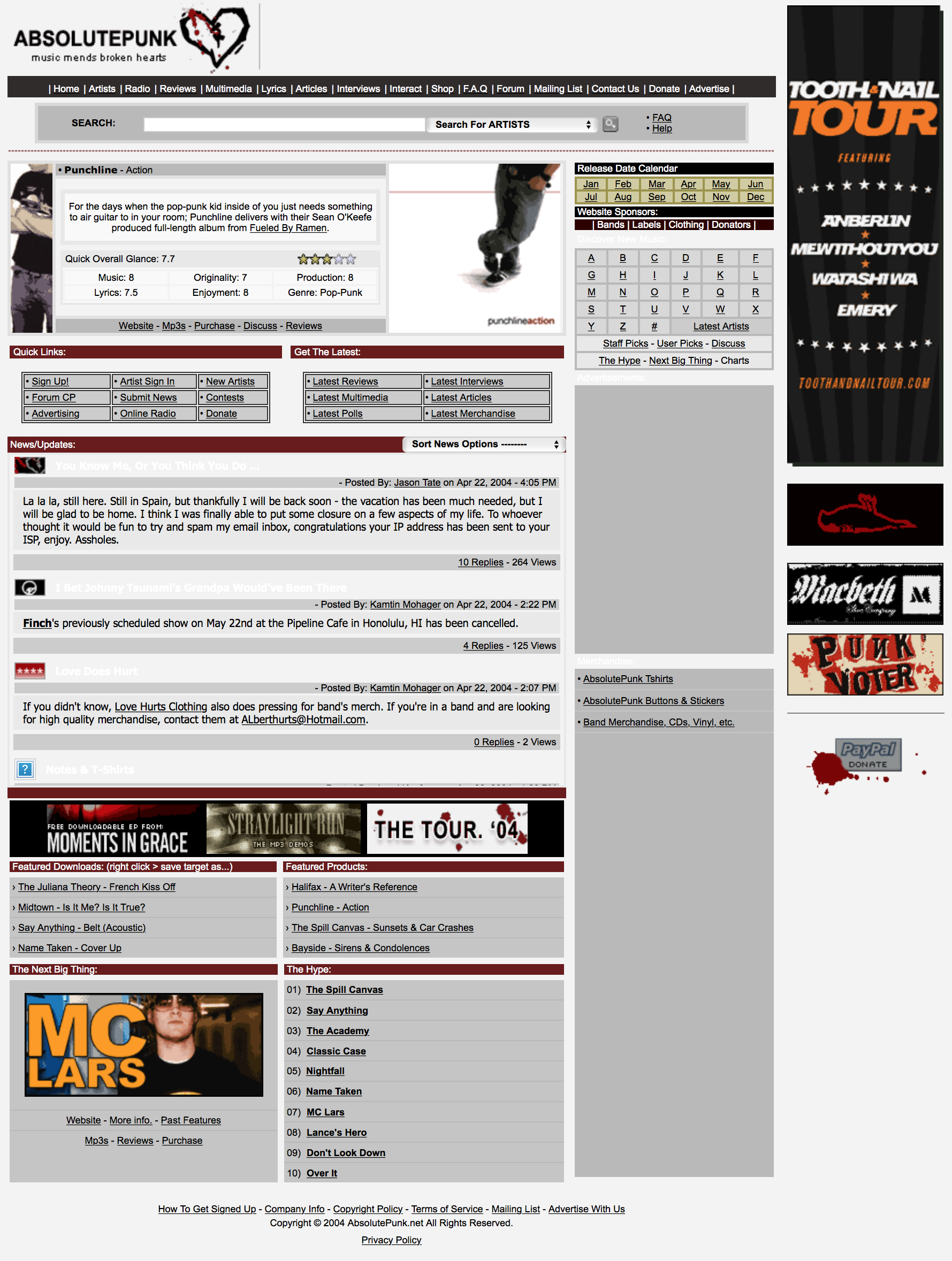
This screenshot having the Straylight Run mp3 demos on it really brings me back in time. This design was put together when I took a semester off from college my junior year to focus on the website and see if there was any chance I could take it to the next level. That summer I would move everything on the website to vBulletin and that would lead to the first version of the design that became the most well known.
2005
Awww, memories. These next few iterations of the website are the ones I remember the most. I was just about to graduate college, the website was taking off, and I was working on it an unhealthy amount. Some real interesting design choices here. Those little modules were fun to to move around the website. I can’t get over that there was not only an email option on every single news post but a print option as well. Odd choice.
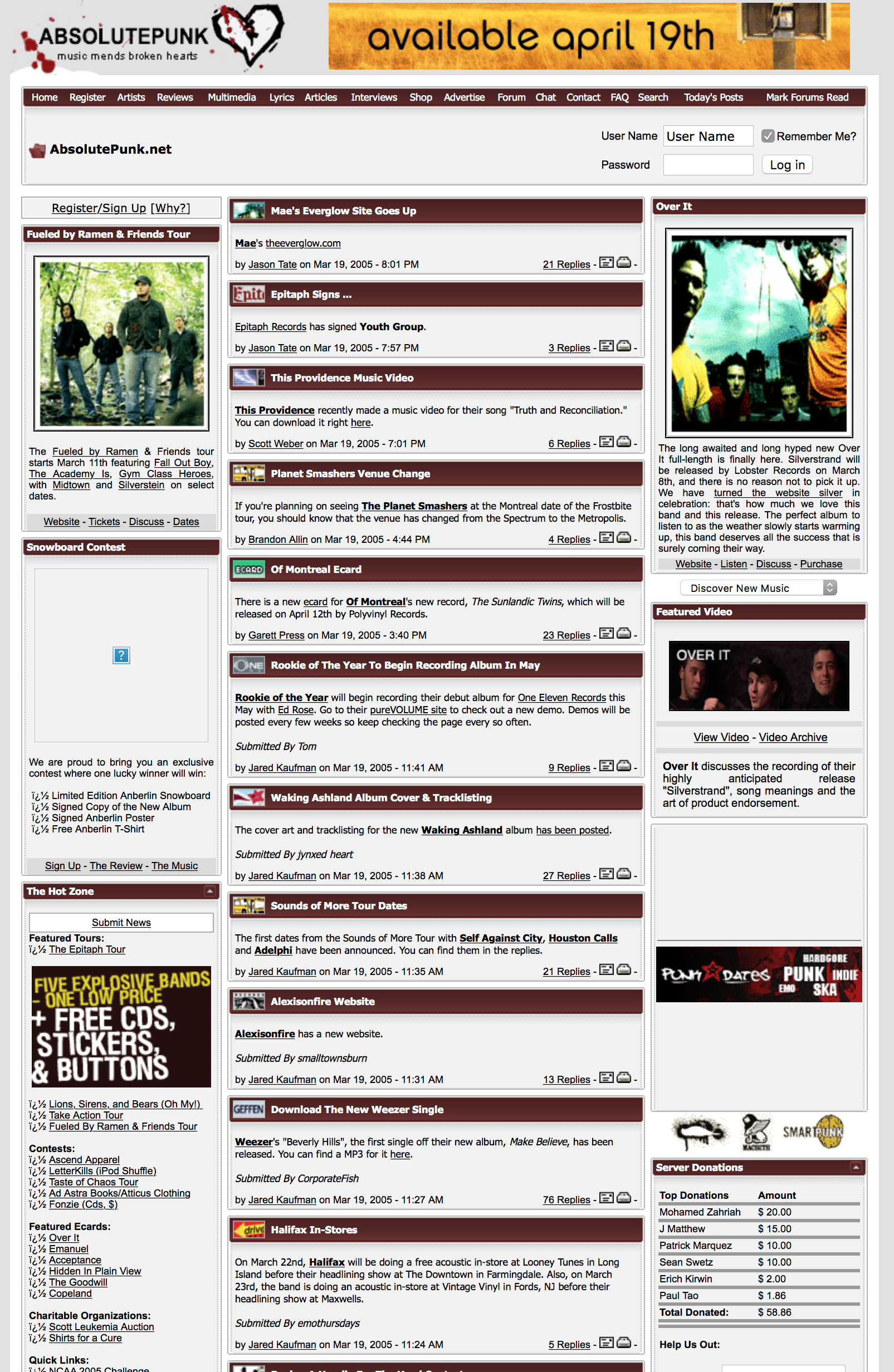
Love seeing all those fun little news icons again though.
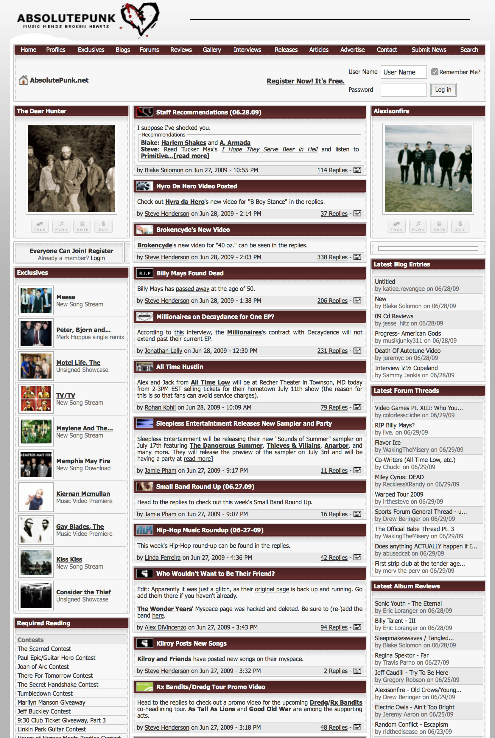
2006 – 2009
The next few years were just iterations on this design. Little tweaks here and there, changing up modules, colors, and wording. I’m pretty sure those buttons under the featured bands were “inspired” by Purevolume at the time. Everything feels so close together and cluttered on these pages:
Around 2009 I made some big changes on the homepage. Cleaning up spacing, colors, and the how I was laying out all the different modules. This specific version, with the “forum feed” and the icons for what forum the thread was in, is extremely nostalgic to me:
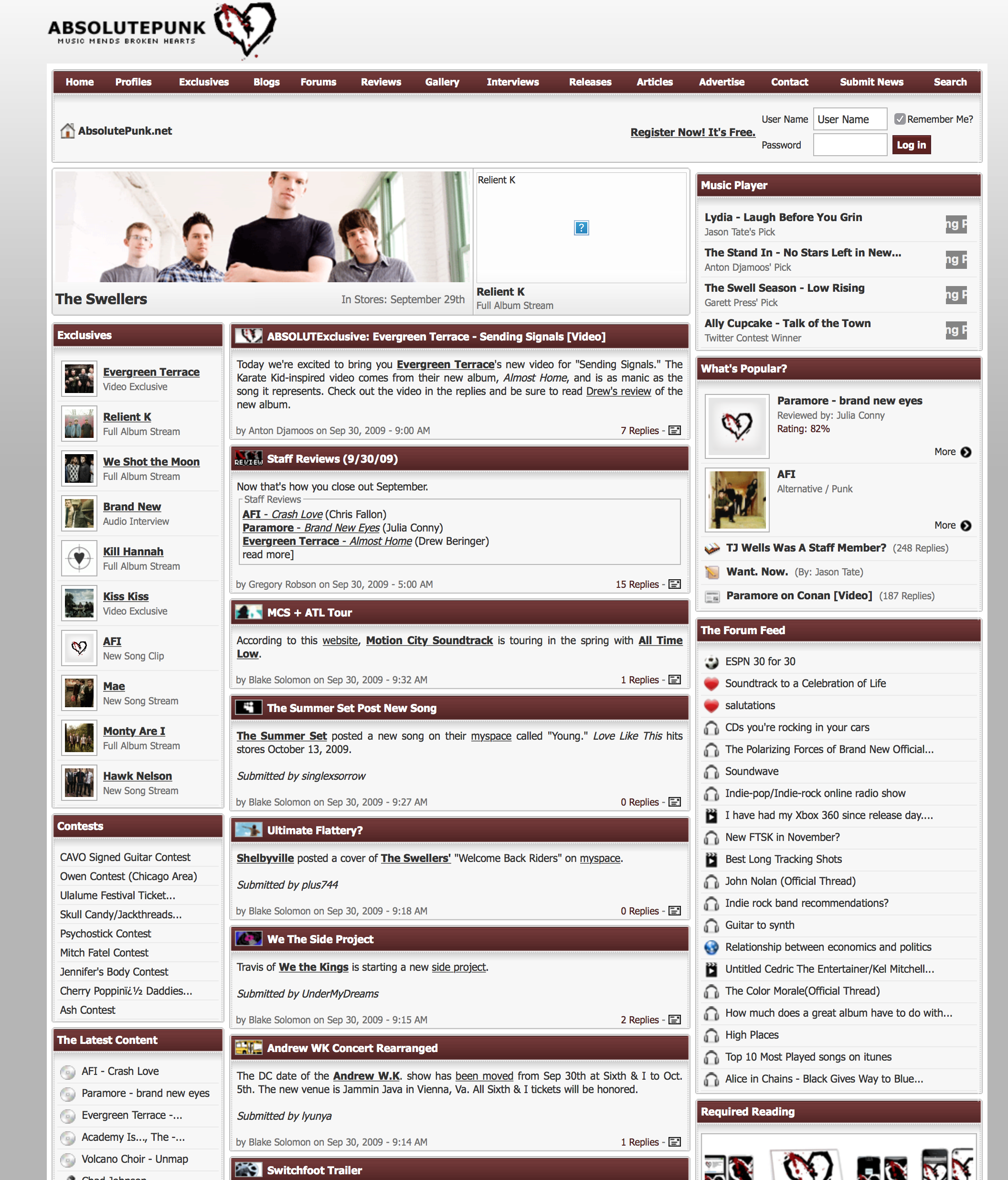
Those featured band spots, at the top, were templates that I would hand edit each day to highlight various stories or featured bands and exclusives. Here’s what an album review looked like in 2009:
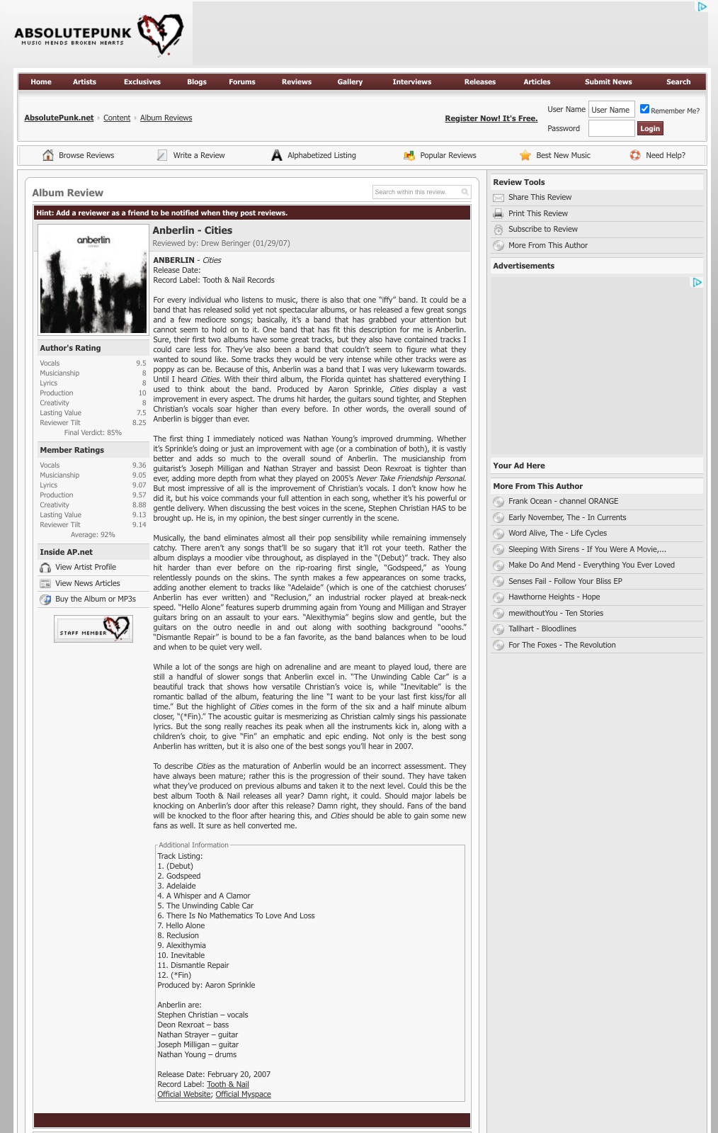
The header is much cleaner. The sections of the website more thought out and streamlined. I really liked those colorful icons.
2010
Not much changed in 2010, but who can forget the special holiday/snow version of the website:
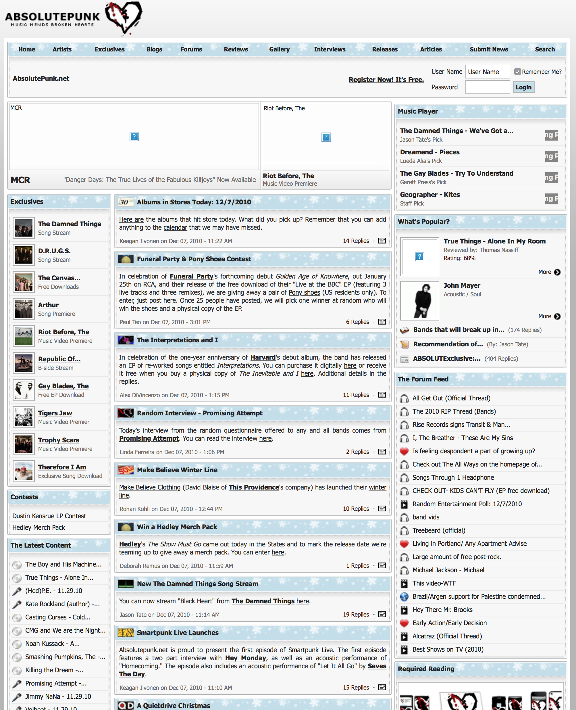
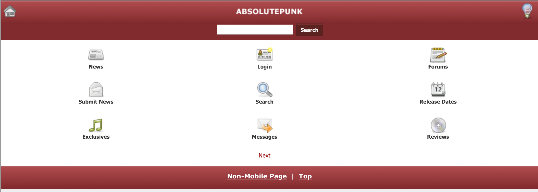
It was around here that the first “mobile” version of the website was designed as well. The first iteration was built to look sort of like how Facebook’s mobile website did at the time:
2012
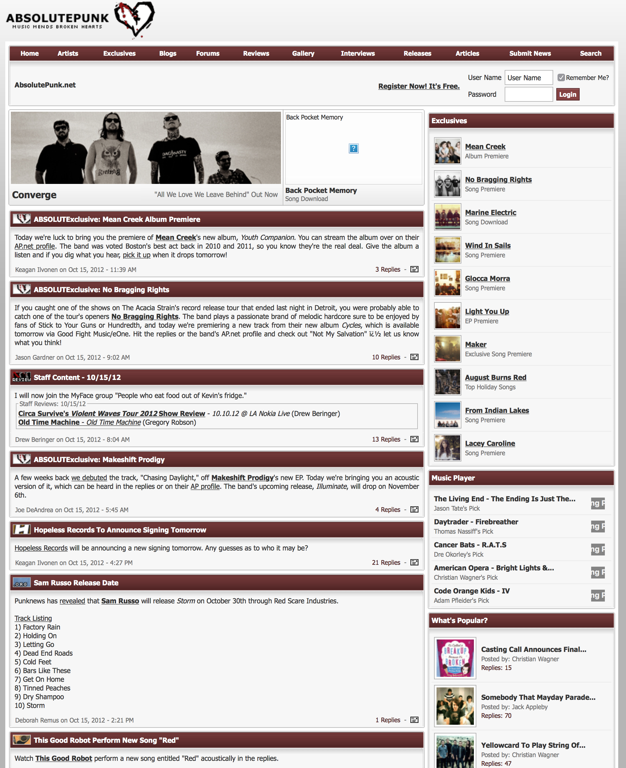
In 2012 I’d ditch the three column layout:
If you want the full experience, here’s a screenshot of the entire homepage, top to bottom, in the snow theme.
2013
I’d darken the red in 2013 (I think this is when I moved to all the red to be CSS instead of a background image) and I changed the logo to all lowercase. There were also some tweaks to the modules around the homepage.
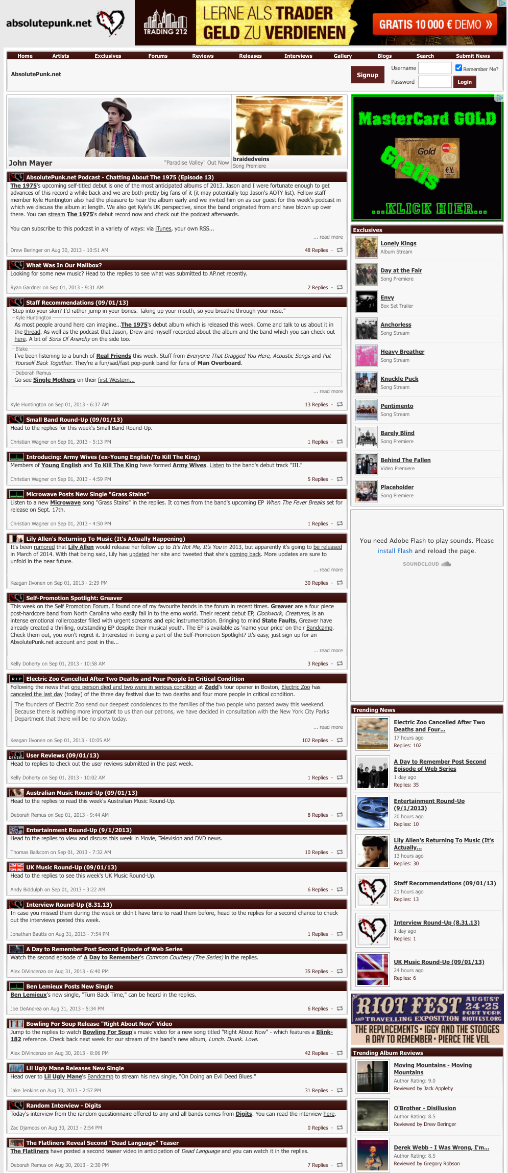
What I remember most about these years, besides constantly posting news, were all the little tweaks I’d make to random sections at random times. I had no formalized workflow for any of the design or code process. It was the wild wild west. Just looking at the code and directory layout gives me nightmare flashbacks.
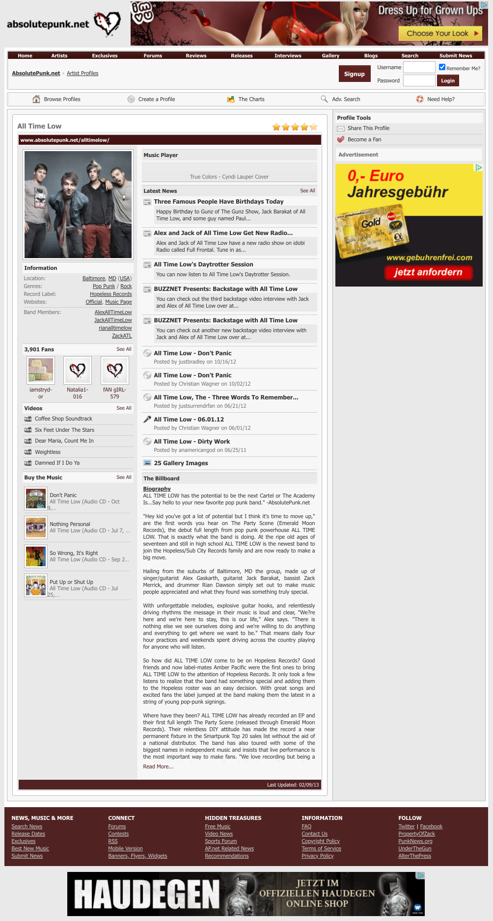
Here’s what an artist profile looked like in 2013:
2014
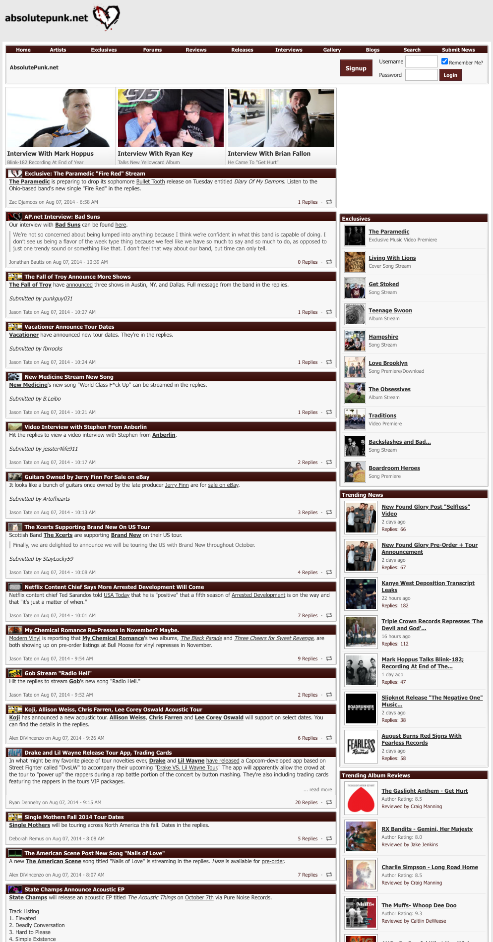
In 2014 the homepage would get three featured spots at the top of the page. Making the images, manually, and then editing these each day was a pain in the ass.
2015
Not much changed in 2015, the homepage is pretty much the same:
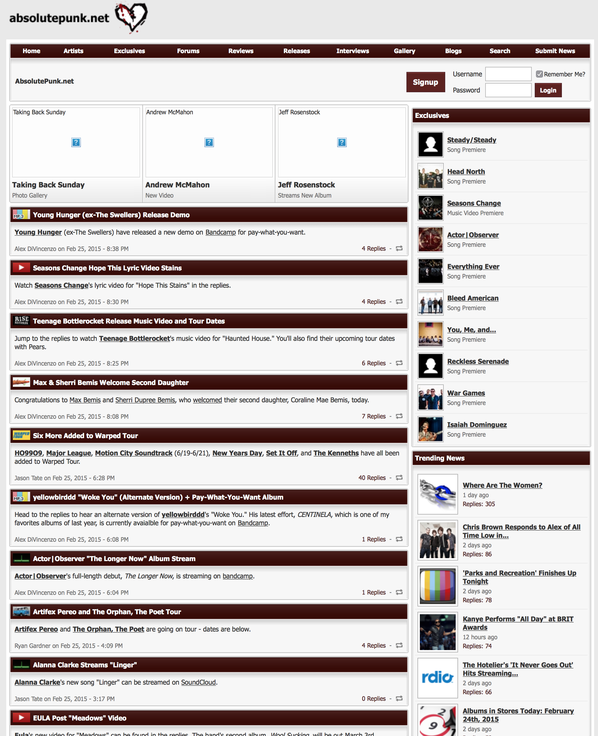
If you want the full experience, here’s a screenshot of the entire homepage top to bottom.
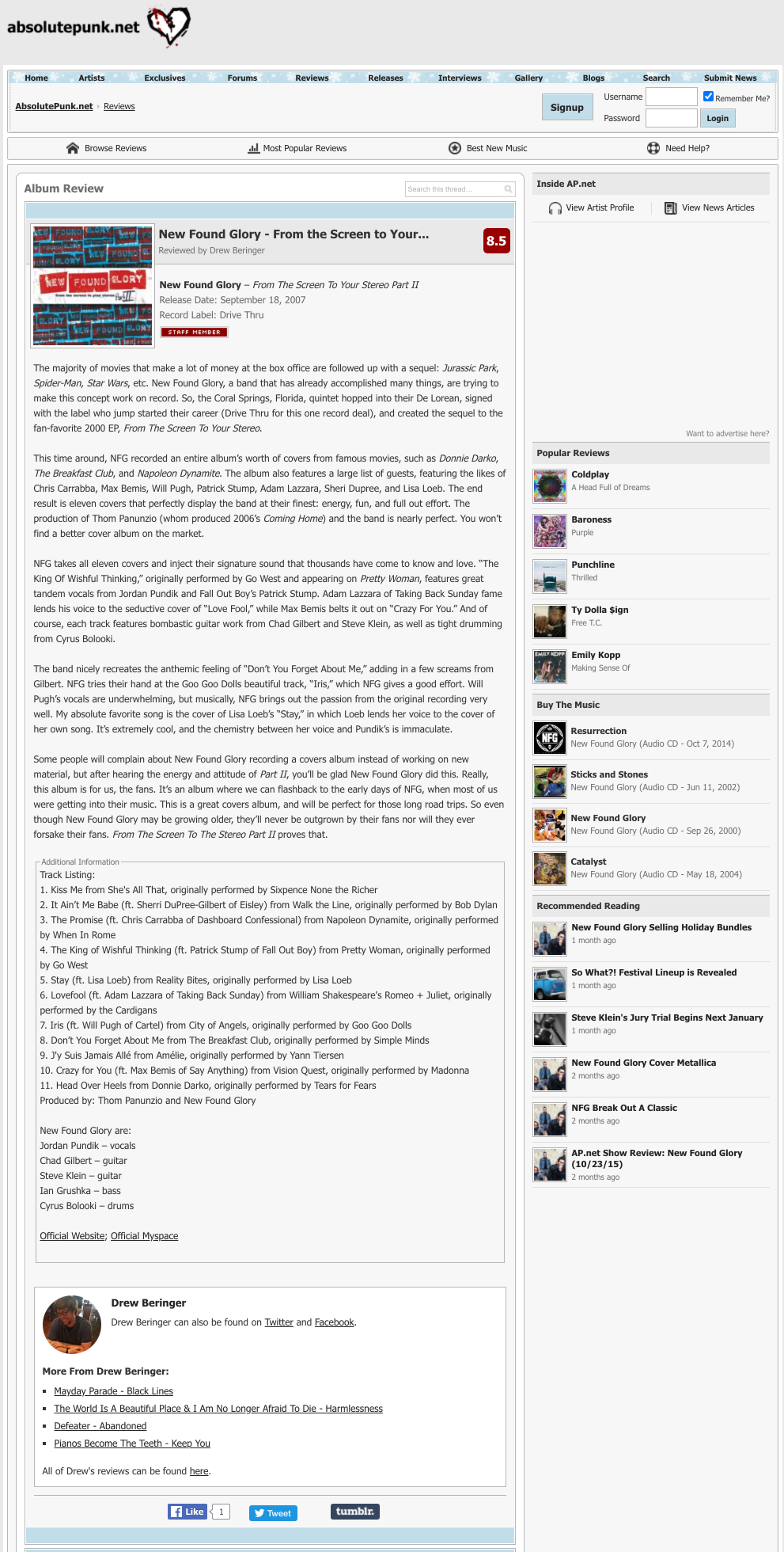
I tweaked the subpages at some point during these years. Went with monochrome iconography and a different layout for news posts, and reviews. Here’s what reviews looked like in 2015, in the winter theme:
It’s funny how many of these style choices can be seen from the very early days of AbsolutePunk all the way through to the current version of Chorus.
2016
And that brings us to 2016.
Here’s what the website looked like on the last day, right before I moved everything over to this website:
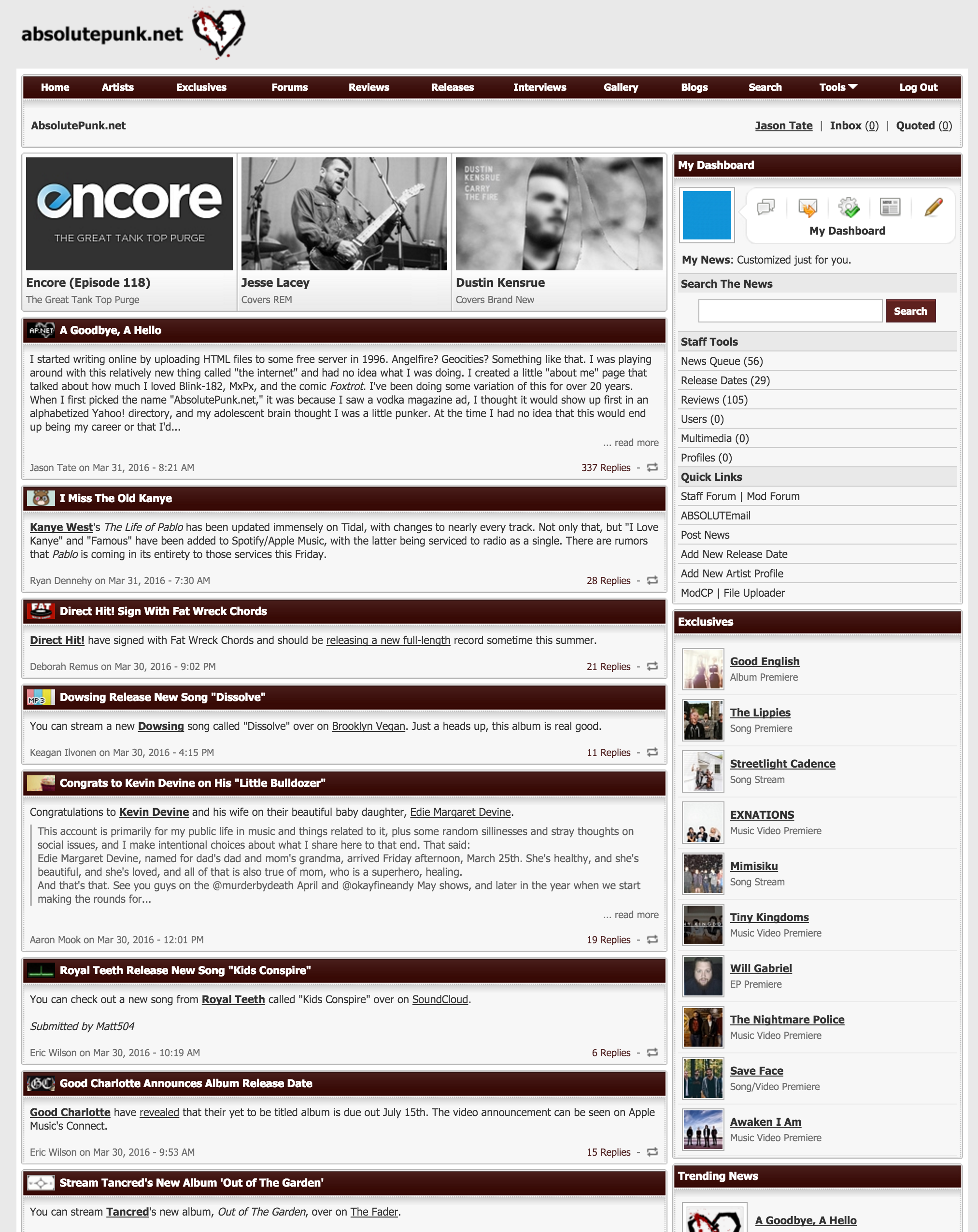
I can’t believe how much of it still had the same “bones” from 2005. Those little dot images around the modules, for example, are now over ten years old.
And here’s what the forum looked like right before I turned off the lights:
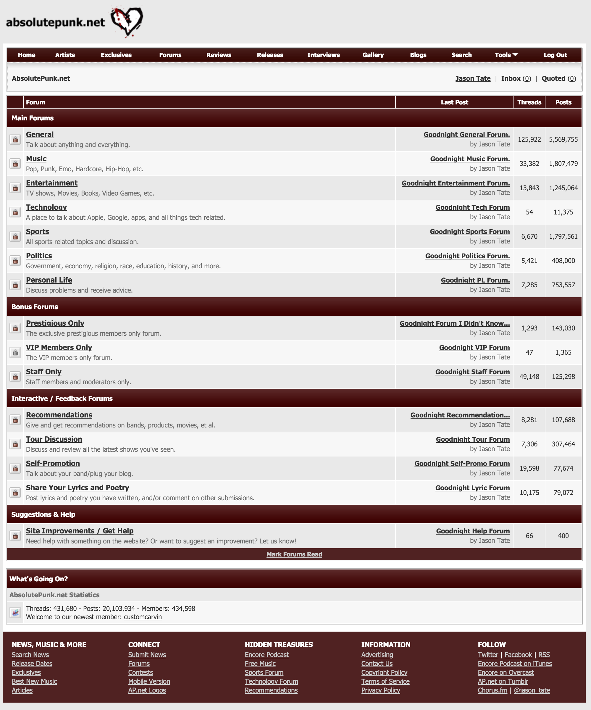
Over 20 million posts. Damn. We’re coming close to 4 million here in our community now. Just a little more to go to catch up.
And, for fun, here’s the actual last post ever made on AbsolutePunk. I filmed myself hitting publish before I moved all the domain redirects to the new website.
And there you have it: AbsolutePunk.net throughout the years.