When I drew the AbsolutePunk.net logo all those years ago, I never imagined how many places it would end up. I can’t tell you how many times we needed to shrink it down, or blow it up, or put it on a colored background, and I’d end up laughing at the little red splatters while having no real idea what to do with them. When I started building Chorus I had a color scheme I loved, but I was never able to settle on a logo that felt right. I tried a few different things before deciding to punt and launch with the word mark while using a blue and white “C.FM” placeholder. I wanted to make sure that this time I thought through everything. That if we had a logo, it was something I felt could stand the test of time and was a true representation of this new website.
I had a few goals in mind: I wanted something that represented the website, was easy to recognize, could be used in very large or very small sizes and still be distinguishable, could be used in virtually any color, or even monochrome if needed, and I was looking for something that had a familiar relationship with both our word mark and the Encore podcast logo. And more than anything, I was looking for that feeling of joy when I saw it — that feeling of, “yep, that’s it.” After working with the same designer that helped birth the Encore logo, I know that we found exactly what I was looking for.

The multi-ring shape is a representation of the word “chorus,” the idea of multiple people coming together in unison.1 The negative space on the right cuts out just enough to create the definitive “C” of our logo. The circle, ring weight, and colors match with our podcast logo. And within that negative space, we find the universal “wave” sign. These waves are usually used when describing sound, or music playing, but just as often they’re used to symbolize the Internet or wi-fi waves. I love this dual meaning and how perfectly representative of Chorus.fm it is. Music and the internet? A beautiful pair.
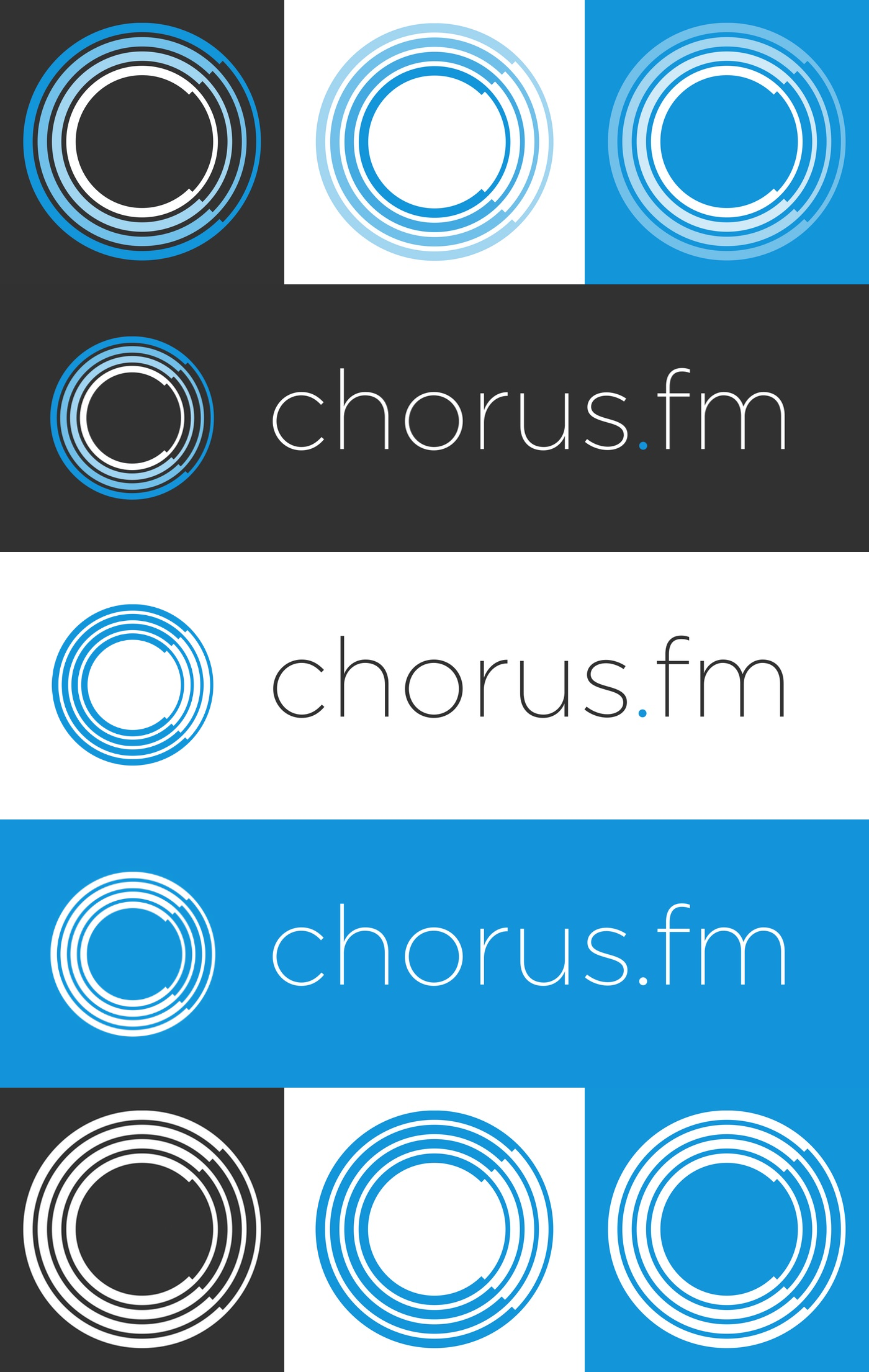
The logo was built to be able to grow to huge sizes for banners, shrink for avatars or icons, and to be ready for print. It’s something we can use on virtually any background and render in any color we need. This includes using it in a monochrome version and letting it stand on its own. It’s built to work with our word mark, or stand strong on a breast pocket.
I’ll be rolling out the logo in different places over the next week or so, but I wanted to show it here first so people weren’t confused when I made the changes on social media accounts, tab icons, and things like that. The plan is still to find the right place to put together a little merch shop of some kind in the future as well. I’d love a hoodie or t-shirt, and of course, coffee mugs and beer glasses are a must. I hope you like what we’ve come up with as much as I do, I’ve put together a little image below of the logo in a variety of colors and sizes:

I’d like to thank grafiksyndikat for working with me on creating this logo and dealing with my more obsessive qualities. They do great work and can put up with me debating line widths and specific shades of white. Once again I also want to thank everyone that’s been a supporter over the past month for all the feedback and all of the amazing support and great conversations. Also, a thank you to everyone that’s read our homepage, reviews, stories, shared an article or two, or participated in the forums. I have to say, pretty damn good timing that we’re getting new Brand New, Blink-182, Good Charlotte, Saosin, Sum 41, The Hotelier, Thrice, and a cornucopia of awesome new music this year. It’s a good year to be a huge music fan.
Downloadable Versions
It has the added benefit of looking a little like record grooves.↩