It’s been a little over a week since I launched the new version of Chorus.fm and I’ve been pretty blown away by the positive response. I think it may be the best reaction to a redesign of any website I’ve ever built. For fun, I pulled out a bunch of the initial sketches I made during the process, as well as some of the various other designs I played around with before actually building the website. I thought some might find the entire process interesting.
The First Sketches
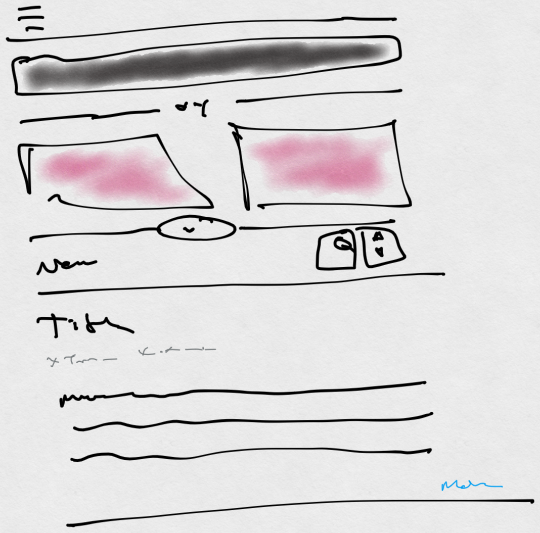
It all starts with a blank canvas and some poorly drawn lines.
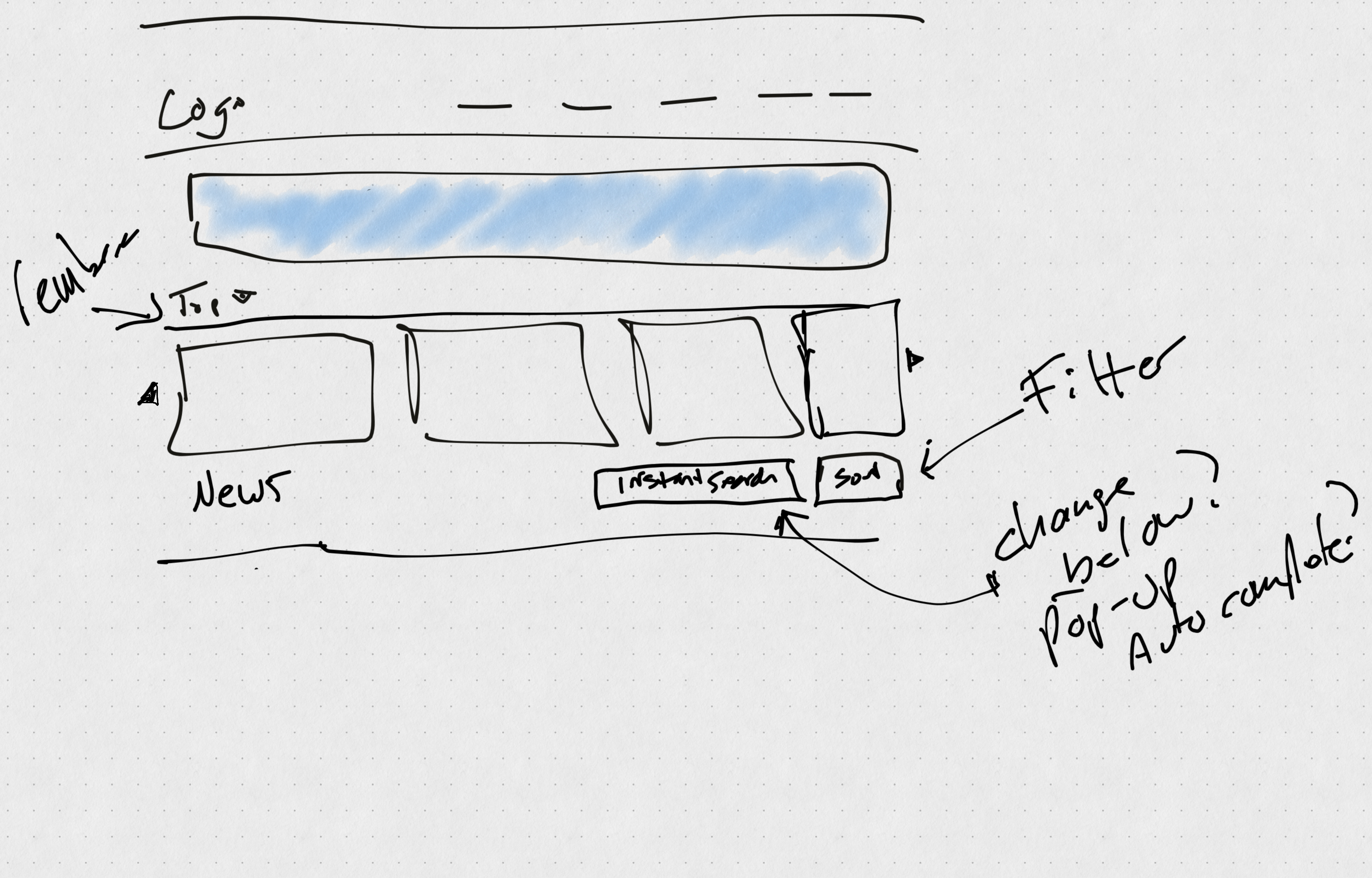
My first idea was changing up the feature header, and I tossed that together in Concepts with some horrible handwriting.
I almost immediately tried to make it a little more structured to see if I liked it, and started thinking about what the news posts themselves could look like. I knew pretty quickly I wanted to integrate images and comment counts on the posts but didn’t have a good idea about spacing at this moment.
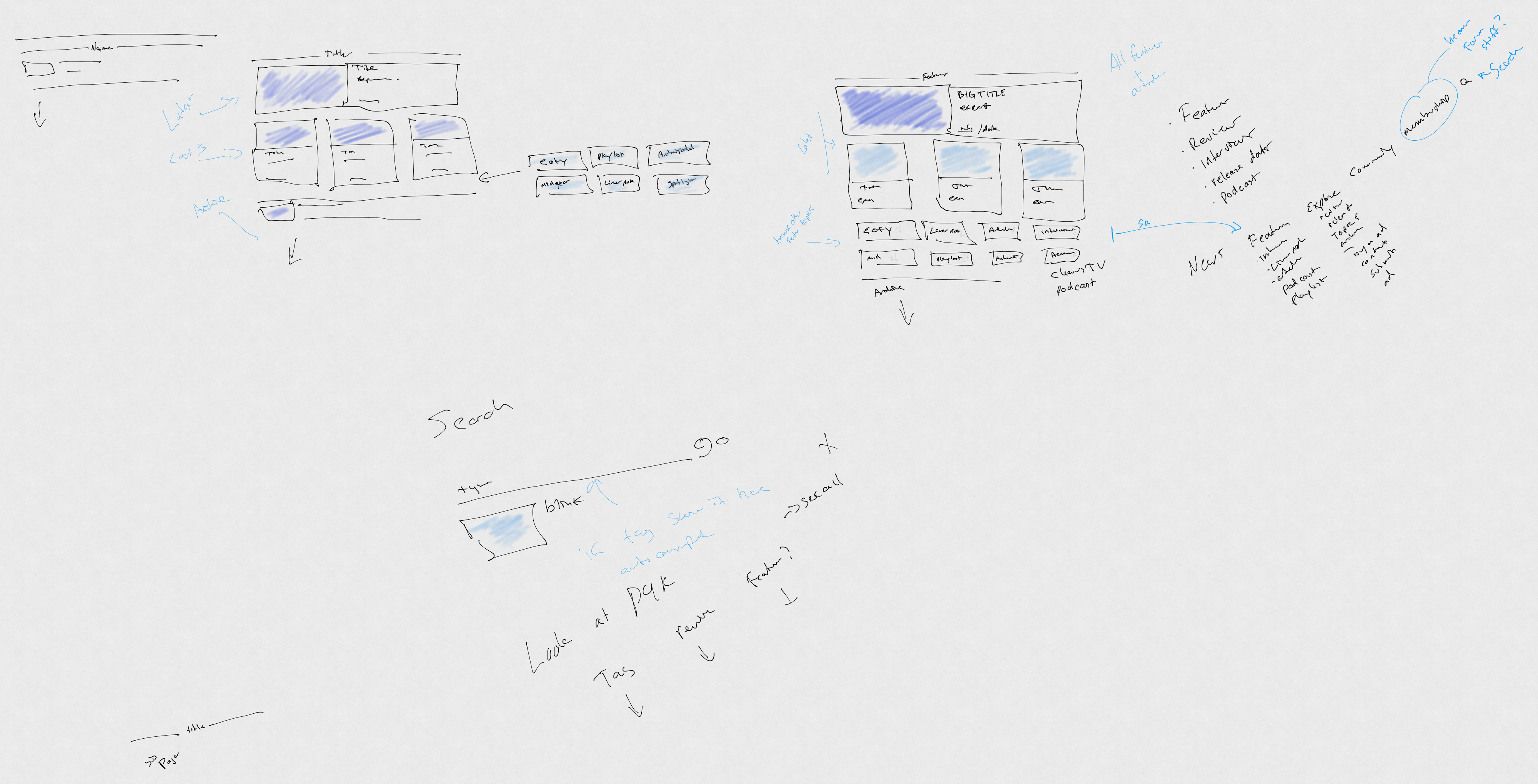
The next stage was a bunch of various brainstorming notes on how the homepage would actually work and various technological and design challenges I would potentially face. I was confident I wanted quick sort and search, but I still wasn’t sure how to handle featured stories and reviews at this time.
I did throw together a quick idea for a responsive version of the homepage as well. I knew I wanted the mobile version of the website to retain as much of the desktop functionality as possible.
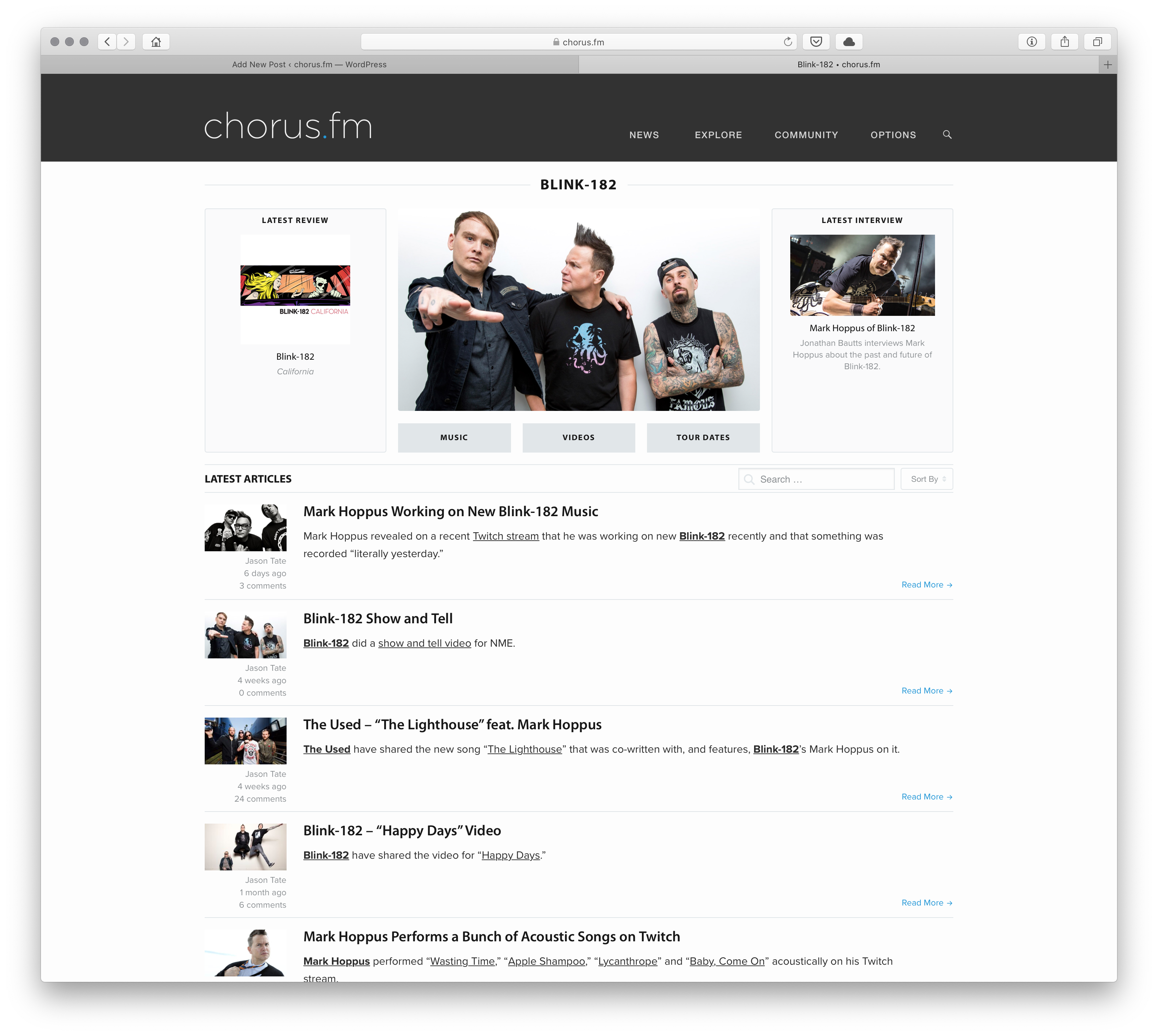
I struggled the most with trying to come up with what the tag pages and some of the various sub-pages could look like. I knew I wanted to do some sort of bigger hero image for the latest feature, but tried a bunch of different sketches to try and find something that looked right.
And tackling the tag pages was just throwing stuff at the wall for the longest time. I must have sketched out twenty different variations throughout trying to find something that would look right. This was one of the more “head-against-the-wall” moments of the entire process.
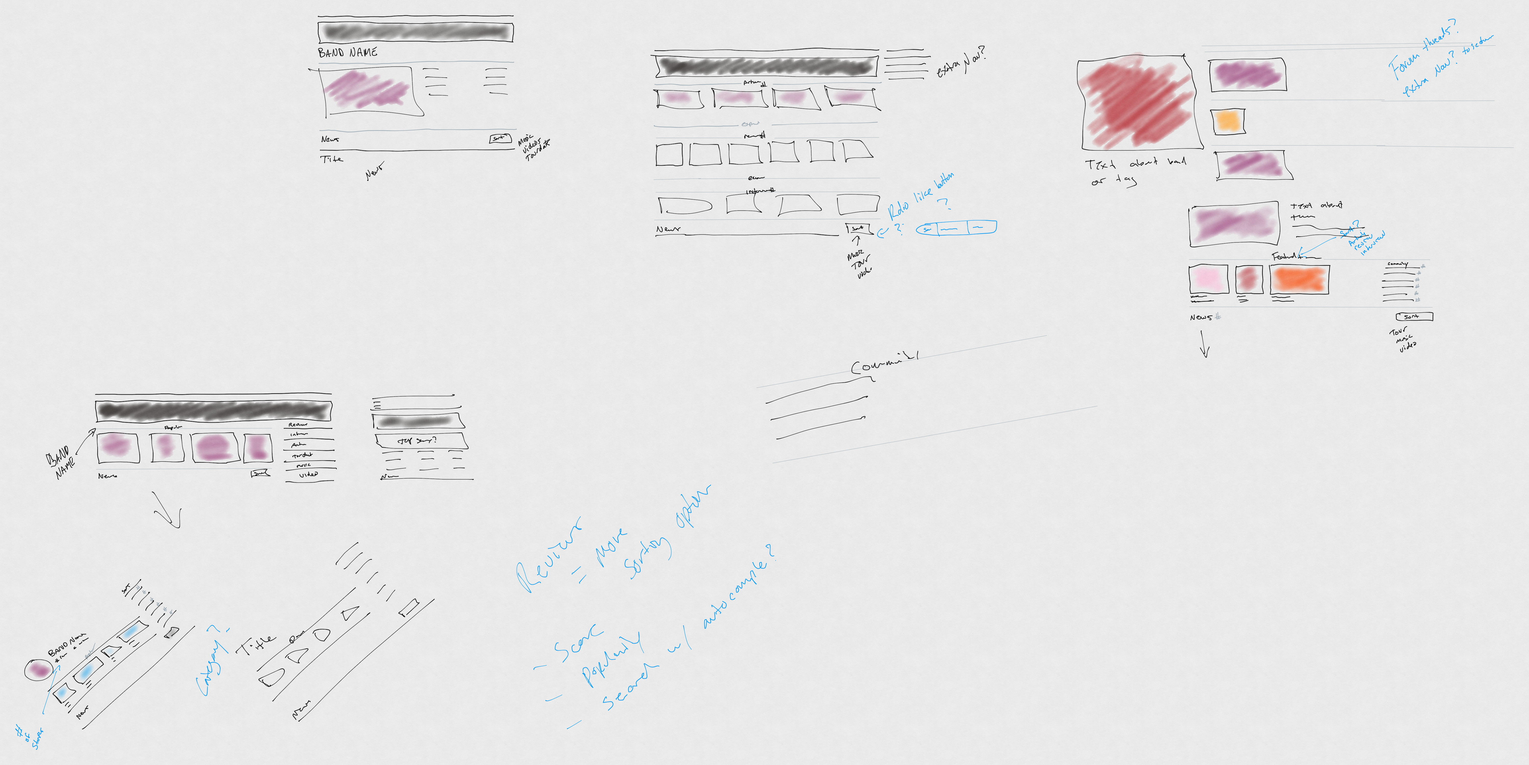
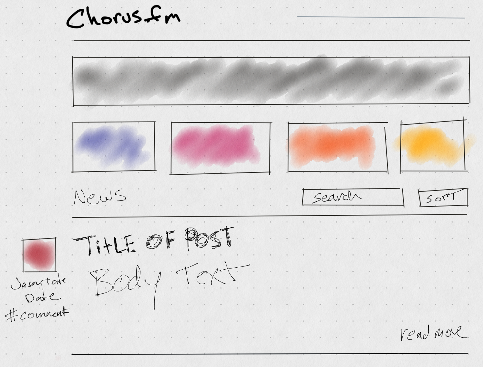
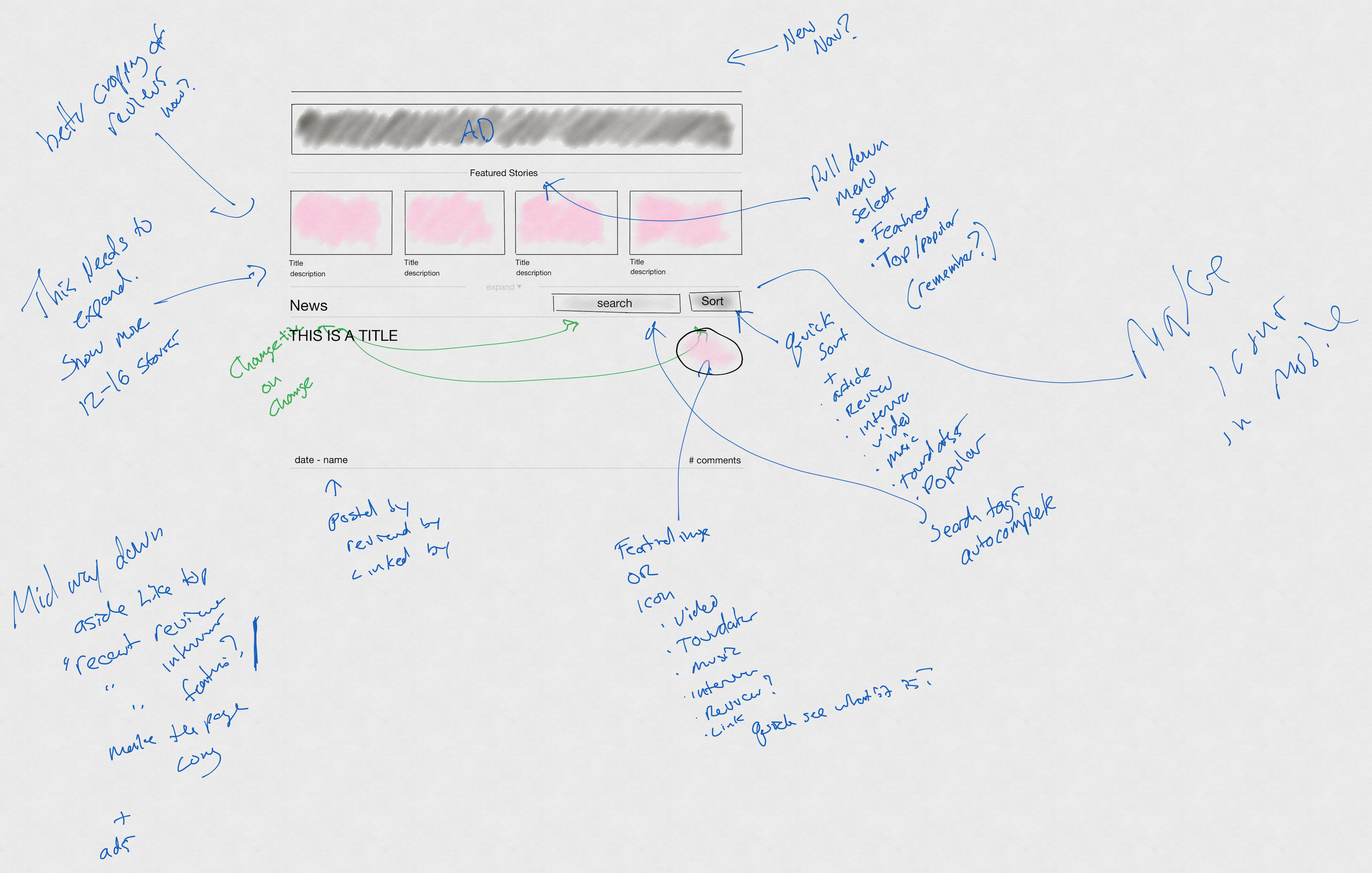
I finally decided to start trying to put more detailed prototypes together in Sketch and figured I’d come back to some of the sub-pages and tag pages later. I ended up designing a good portion of the website here and making notes to myself about various interactions and how I envisioned the website actually working as a live entity.
Moving to Sketch
Even though things seemed to fly along for most of the various sections. I still could not get a design I liked for the tag pages. I tried so many different things that just never felt right.
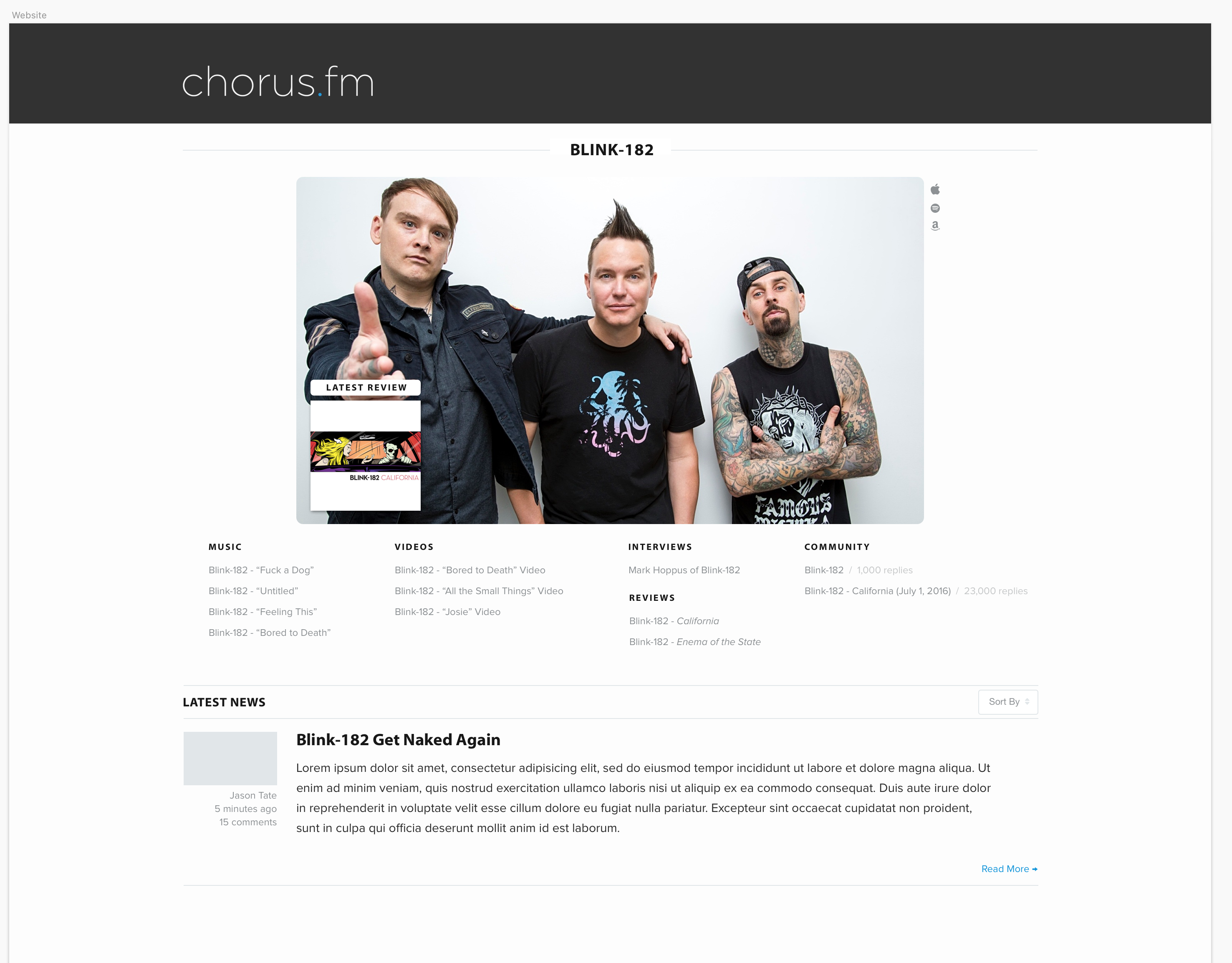
There was the giant hero image version:
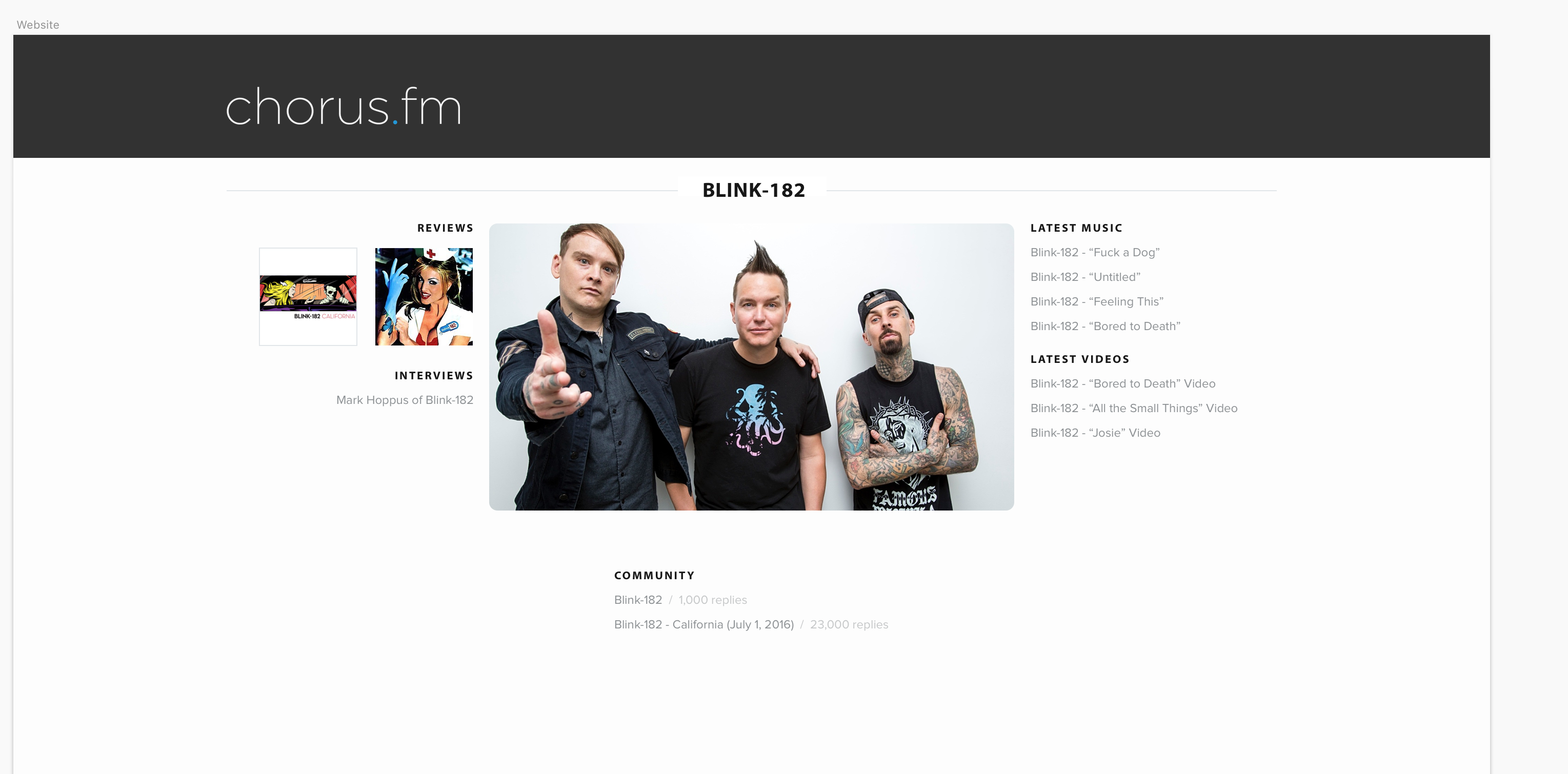
Another attempt at moving around the pieces:
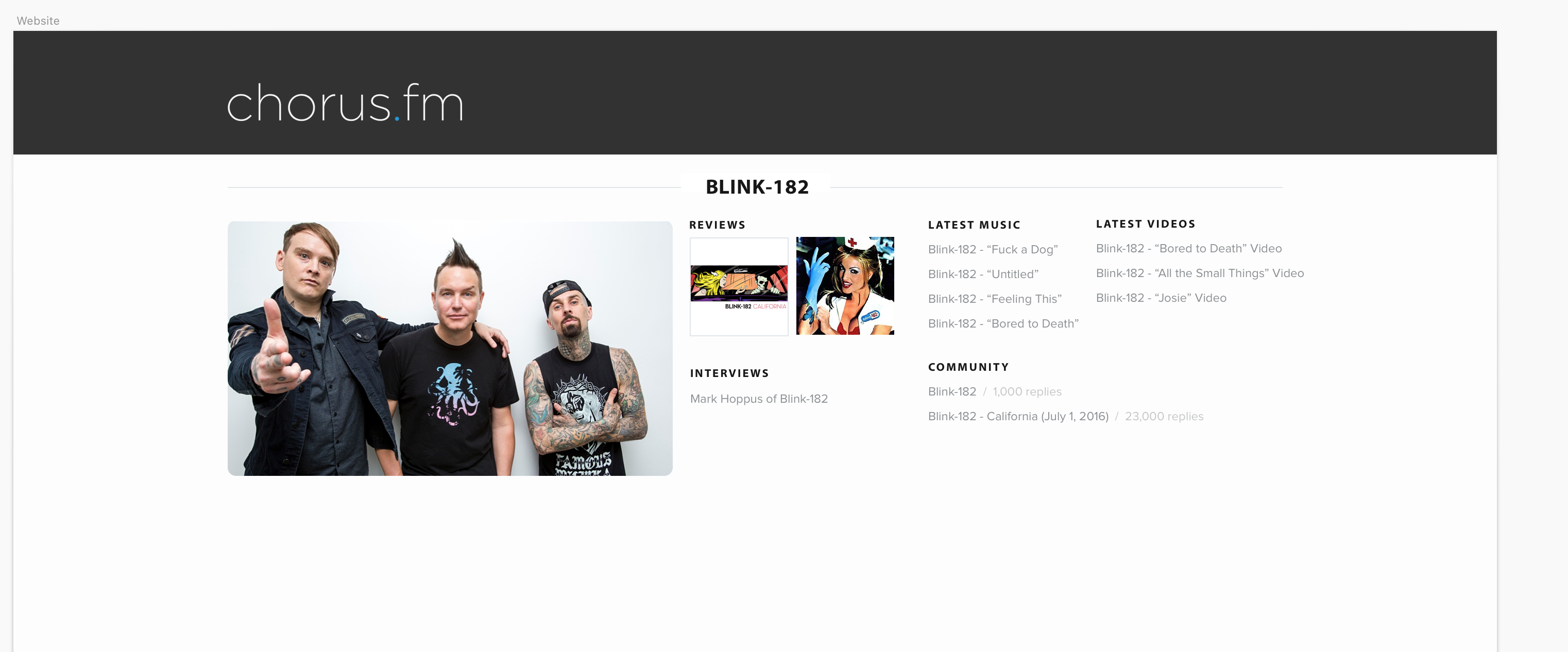
And I don’t even know what I was doing here:
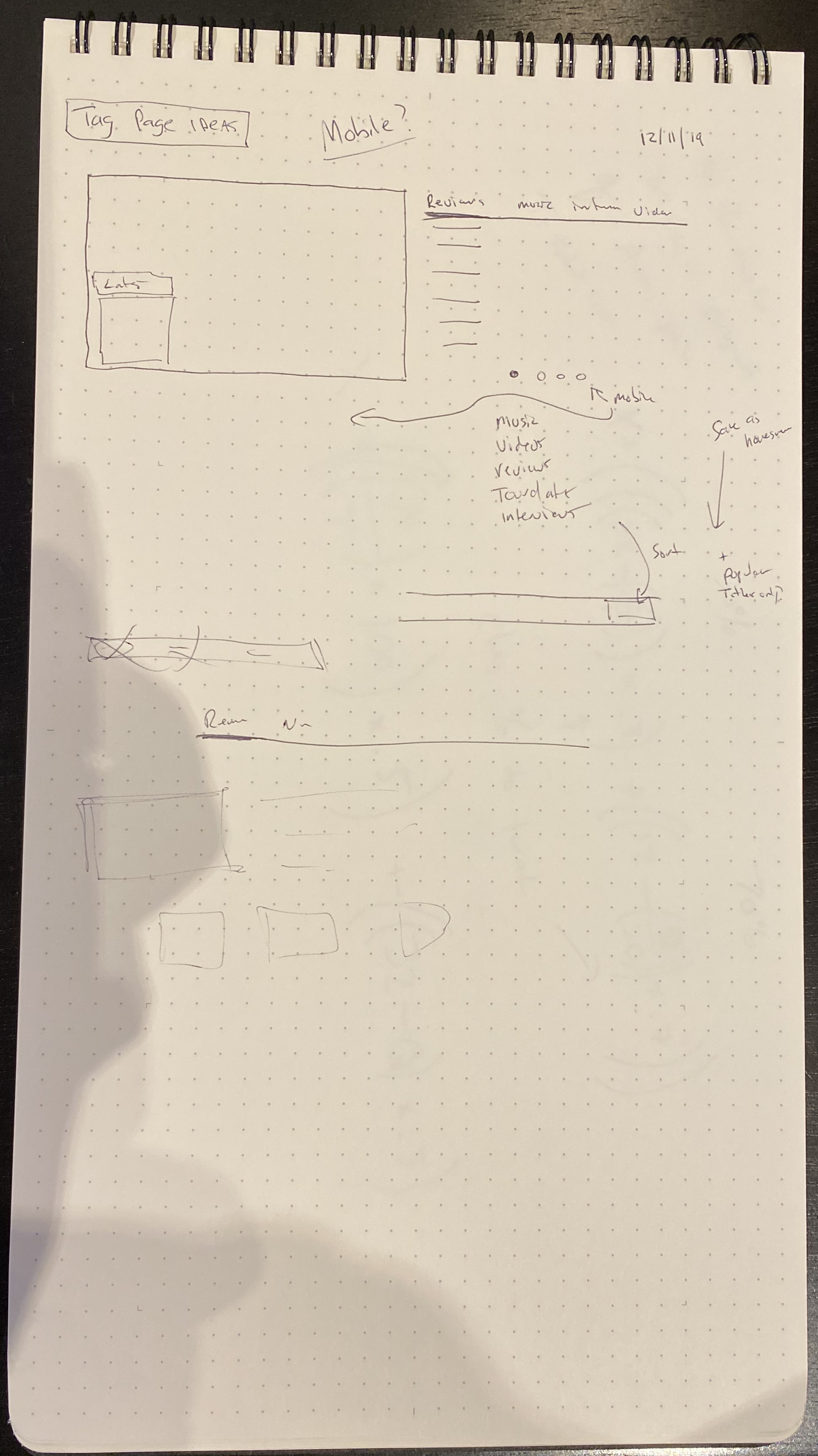
I got so frustrated I even pulled out a pen and paper and tried drawing various different ways it could be laid out.
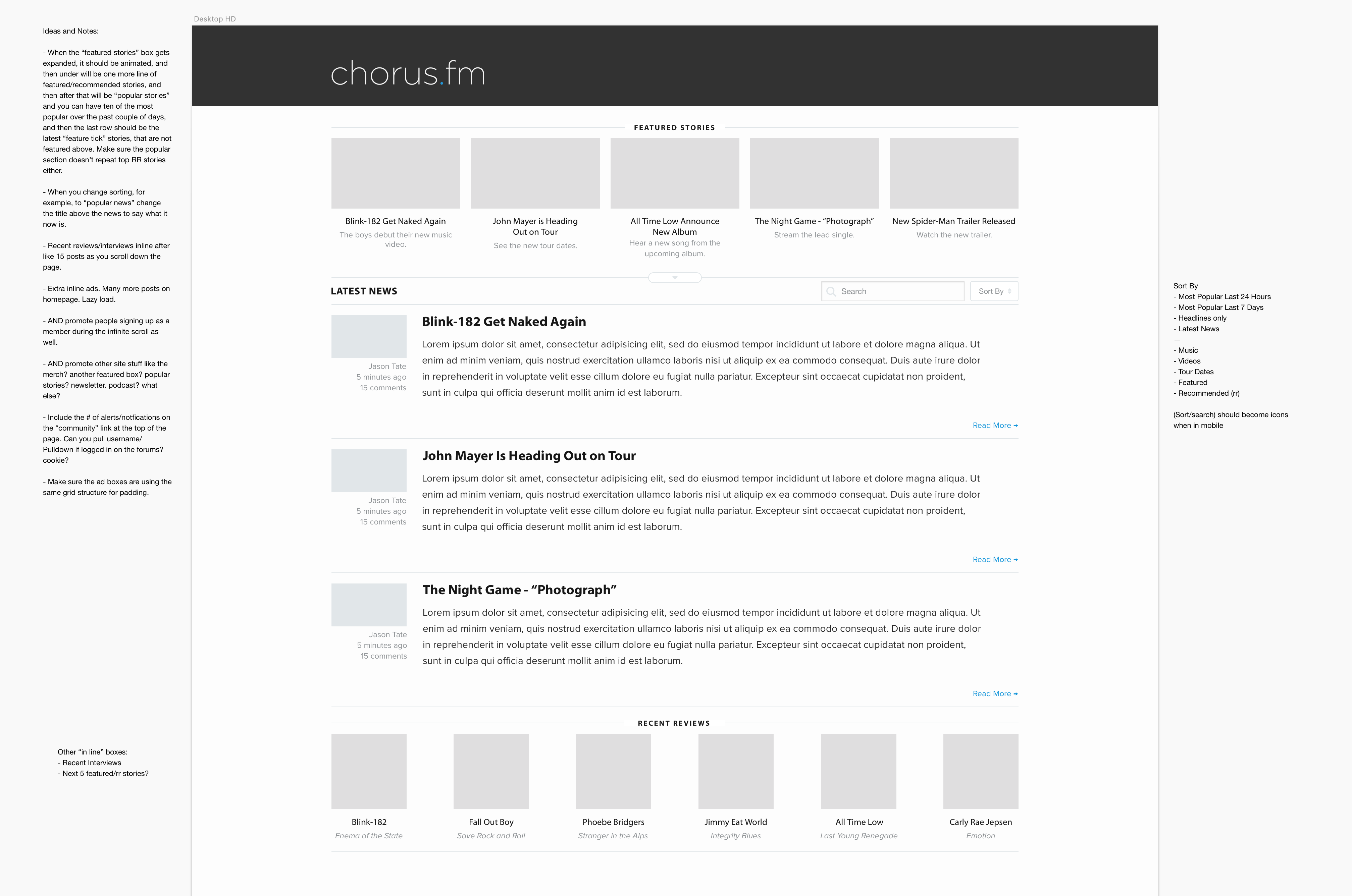
The final version, that you now see on the site, was the very last thing I did and it was designed while coding. One night I just had a weird spark of inspiration and decided to try something completely different than everything that had come before. Almost immediately, I knew it was what I was looking for. I knew the header image with reviews and interviews on the side, with quick sort buttons right under, was the look that was eluding me. I think putting the content in the little rounded boxes was what finally clicked right my brain.
Some of these images stretch back into the early part of 2019, and I sometimes can’t believe I’m actually “done” with this part of the process. Launching the website last week, spending a bunch of time fixing bugs, and getting to the spot where I don’t have any more launch day bugs on my task manager, was a huge milestone. I still have a lot more that I’d like to work on, and quite a few new fun features and content related things I’m preparing to launch next, but this step, this version of the website, is now officially out into the world.
The past week of using it has brought a smile to my face daily. I hope all of you have enjoyed it as well.