Chorus.fm gets updated with new features regularly. All of the latest fixes and updates are tracked below. The website announcement thread is also updated with new changes, so you can follow that thread to be notified of updates.
February 28, 2024
2024.06- Fixed the ranking page to allow for “curly” quotes.
- Fixed the spacing around the “Search…” ellipsis.
February 16, 2024
2024.05- Fixed the issue where page titles and links were not showing properly for trending posts in the homepage carousel or in the popular posts section in article footers.
January 28, 2024
- Fixed some bugs with the new deactivate embed feature to better conserve browser resources. Now, with the “do not embed” setting on embeds do not load in the browser at all until activated by the user (by clicking/tapping the placeholder). This greatly improves performance.
- Restyled the placeholder to be a little more button-like to make it more obvious it can be tapped or clicked on and to differentiate how it looks from the “blocked user” feature.
- Added the feature to all of the auto-embeds that are active on the website, and optimized their code, so that when the option is turned on it works exactly how one would expect and removes all embeds. The only media that is still shown automatically with this feature turned on are inline images. The forum feels incredibly fast, especially on mobile, with this turned on and it is now my recommended way to browse the forum.
- Cleaned up and removed a bunch of old code around previous embeds that no longer work. Going forward, the media that can be automatically embedded includes: Apple Music, Bandcamp, Giphy, Imgur, Instagram, SoundCloud, Spotify, Threads, Twitch, Twitter/X, Vimeo, and YouTube.
January 27, 2024
I added a new “Embed Preferences” option for forum accounts. Due to bad management over at Twitter (uh, I guess, X?), there’s been issues with their embed code crashing the browser if there are too many of them on one page. This new option can be found on your Preferences page, and there are three options:
- Always Auto Embed: This is the default option and how the website has always worked up until now.
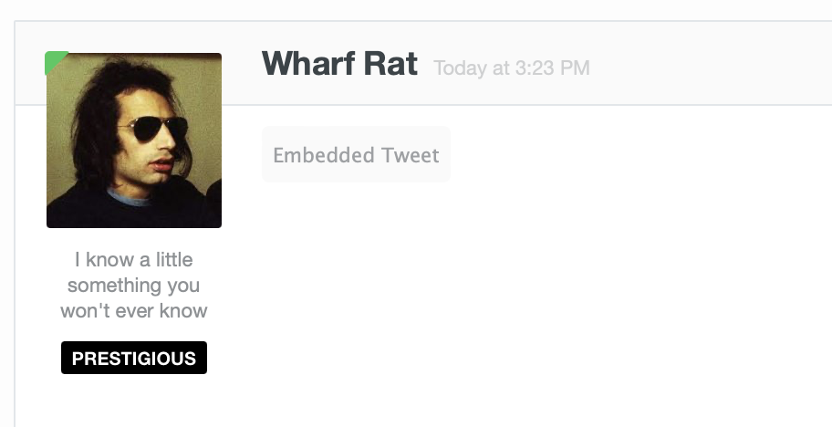
- Do Not Auto Embed: This will disable all of the embeds in the forum. You will see a small placeholder on posts where embeds used to display. Clicking, or tapping, the placeholder will load the hidden media.
- Do Not Auto Embed on Mobile: This will hide the embeds only when you are browsing the forum on a mobile device. This way you can still see full embeds on a desktop computer, but save your phone the stress.
Hidden embeds look like this until you click/tap them:
This should work with all multimedia embeds on the website (social media posts, videos, etc.) and if you see any issues or bugs, please let me know.
January 26, 2024
- Fixed an issue with the title of Chorus articles not being automatically parsed and added when linked in the forum.
- Fixed an issue with images from Chorus not being able to be embedded the forum.
- Fixed an issue with there being a long delay between articles being posted on the main website and imported into the article discussion forum. This should now once again be under ten minutes.
- Fixed an issue with some RSS feeds not properly rendering in some readers.
January 20, 2024
2024.04- Minor change so that authors can have default avatars even if they don’t have a Gravatar set up.
January 15, 2024
2024.03- The search results page now returns the full (above fold) article, complete with formatting.
January 12, 2024
2024.02- Fixed an issue where contributors couldn’t edit posts after they had been approved for publication.
January 2, 2024
2024.01- Another year comes to an end, and the holiday logo has been retired.
December 1, 2023
2023.23- The return of the Holiday logo.
November 1, 2023
2023.22- Minor changes to the backend of the main website to update some out of date resources.
September 21, 2023
2023.21Better styled the “clear sort” button that I added yesterday, and brought it to the tag pages and homepage. So, now if you’ve sorted a tag page, the homepage news, or an author page, you can easily clear that sort from the menu:

September 20, 2023
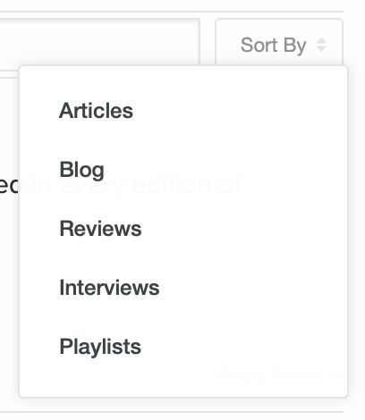
2023.20I added a new feature to the author pages so that posts from an author can now be sorted by topic. This mimics the feature on tag pages and lets you do things like quickly see all the reviews, interviews, articles, playlists, or blog posts from a particular writer.
September 18, 2023
2023.19- Added a “single reviews” sort on the review page so you can filter all of the single reviews.
- Added a “single review” banner (like we have for retrospective, first impressions, book, and movie reviews) to better call out when a review is just for a single song.
- Fix the bug where Apple Music embeds weren’t properly centered on news posts.
September 8, 2023
This evening I added a long requested feature in the forums. There is now a small notice alerting you when a post contains a quoted post from someone you have blocked. Now, when you see random responses that feel out of context you can be assured you’re not missing anything (you think is) important:
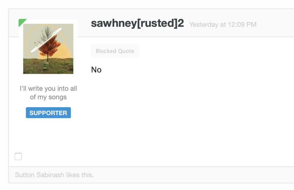
I tried to make the notice as small and unintrusive as possible, while still letting you know there is blocked content there.
September 6, 2023
2023.18- The Rank Anything and Share Music pages now both have Dark Mode themes. These activate based on your system theme and are available to everyone.
- The links on the support page for perks now link to the respective parts of this release notes page.
September 5, 2023
2023.17- Updated the Share Music page to use a more modern version of my bootstrap code. This cleans up some of the basics of the page and makes things look and feel a little nicer on the main screen and the music pages themselves. Errors also fail more gracefully now, and I made couple tweaks on the backend to make it easier for me to create these in bulk for use in the newsletter.
August 31, 2023
2023.16- Minor additions to the Rank Anything page. Fixed up how I was pulling in “popular rankings” to use a better format and added a link at the bottom to show a list of popular rankings.
August 30, 2023
2023.15- Minor update to fix some bugs to the Rank Anything page. A few CSS issues, making sure the keyboard arrow shortcuts work correctly, and added in a small rotating list of popular rankings at the bottom of the page.
August 29, 2023
2023.13- Launched the new “Rank Anything” feature. The announcement blog post is here.
August 18, 2023
2023.10- Re-configured the advertise page. Re-worded some of the bullets to make it more clear, added new and updated estimated audience numbers, better defined and updated what’s offered in a sponsorship.
- Created a new sponsorship sticky “header” similar to the one that runs at the top of the news page for the forums so that we can bring sponsors to our forum members as well.
- Created a new class for sponsors in the newsletter so that they can be better called out.
- Created this page to use going forward; so meta.
August 14, 2023
2023.04- Changed the links in the Explore menu to be more organized and include the more used sections.
- Cleaned up the links on the footer to link to the internal newsletter page and created a new feeds / socials page that contains information about all our RSS feeds and social media links. With all the changes at Twitter I don’t want to link to that on every page of the website any longer and keeping everything in one spot makes more sense.
- Made the other newsletter links around the website also link to the internal page instead of sending people offsite.
- Updated our Contact page to better organize it.
June 9, 2023
2023.03- Added Threads profile links on author/profile pages on the main website and forum.
- Added Threads auto embeds in the forums.
December 29, 2022
2022.22- Changed the wording on the newsletter modules to remove the word “Friday” since the newsletter goes out weekly, but on what date often changes.
December 28, 2022
2022.21- Added verification links for Mastodon to our footer and author profile pages.
- Added Mastodon as an option on profiles in the forums.
December 27, 2022
2022.14- Big update to the supporter system and how it works. Detailed at length here.
March 27, 2021
- Instagram Reels now auto embed in the forum.
March 6, 2021
2021.03- Minor bug fixes to some of the categories that were not using infinite scroll correctly.
September 8, 2020
2020.29- Cleaned up the notification link on the main website so that when a user has a notification it will automatically redirect them to either their notifications page or their inbox depending on what the notification is.
- Changed how timestamps work. After my revival project for a bunch of old AbsolutePunk content, I decided to make a slight change to date formatting on the website. I use relative date formatting (“3 hours ago”) for most timestamps. This is great for most things because it gives a quick idea of when something was posted. I’ve always had the ability (on the forums too) to hover over a relative date with your cursor to see the full “hard” date and time of a post. However, this doesn’t work great on mobile, and for some of the older posts/content saying something like “18 years ago” isn’t super helpful. So, I’ve tweaked it to show the “hard” date for posts after 6 months have passed. Hovering over the timestamp will still give you the full date and time just like before. Now, when you come across older content, you’ll have a better idea of exactly when it was originally posted. (When I brought back these older posts, I used the original date so everything matches up and is in the right place chronologically on the website.)
September 7, 2020
- Brought back a bunch of old AbsolutePunk.net content to the website, including a bunch of old reviews and interviews.
August 18, 2020
2020.25- Added an extra “view all” link/button If more than five reviews or interviews exist for an artist on their tag page.
July 21, 2020
- Twitter removed how I was detecting if a tweet was deleted when embedded, so I fixed the tweet embeds to once again show an error if it’s been deleted/can’t be rendered, instead of just not doing … anything.
July 14, 2020
2020.23- Added some new featured boxes/quick links to the feature page.
July 10, 2020
2020.21- Fixed issue with my footnote pop-over not working correctly on the homepage with infinite scroll.
June 29, 2020
2020.18- Fixed some minor bugs on the main news article pages.
- Spotify embeds.
- Linked list posts had an issue with the arrow graphic.
- Ordered list needed some fixes for when there were nested lists.
- Added a timeout on the comment count script so that if the forum is down it uses the old cached version of the comment count instead of trying to get a new one.
June 18, 2020
- New supporter perk: more posts per page! Supporting members now have the option to see even more posts, threads, and conversations per page. No longer be held back by the measly 45 posts per page, now you can see what life is like with 55 or even 65 posts per page if you’d like. You’ll find the new options on your preferences page.
May 29, 2020
2020.15- Removed personal blog posts from being in the RSS feeds or imported into the forum for discussion.
- Added review banners (first impressions/retrospective) to the images on the homepage and in the carousel.
May 15, 2020
2020.09- Cleaned up the lazyload code so that images load on the screen in a cleaner, faster, way.
May 13, 2020
2020.04- Made all video posts/embeds on news posts responsive.
May 10, 2020
2020.01- Launched Chorus 3.0. Wrote up a longer blog post on the launch here, and more details about the design process here. (Archive screenshot.)
May 7, 2020
- Bug fix: Double tap once again works to take you to the bottom a forum page.
January 21, 2020
- Launched an expandable posting box on mobile in the forums. Since, I believe iOS 11, when you would type in a textarea in the browser, it would automatically expand to fit the size of all of your words. This was something built into the operating system and not something I could control. In theory, it’s a nice idea, however it had one pretty big side effect. Once you typed enough that the textarea would expand, it would go down below the keyboard on the screen and you could no longer see what you were typing. It was an annoying game of type, scroll, type, scroll. In iOS 13 the Safari team fixed this and textareas no longer expand with the content inside. This means you’ll always be able to see what you’re typing into the message area, but, it also means that the message area is one fixed size and if there’s a very long message inside, it can feel a little cramped. Today I’m adding a new feature to help address this. This expand/shrink button will expand the posting box to fill up your entire screen giving you far more real estate for your message. This is great for long messages, needing to work with longer quotes, or reading back through a long post for edits. I’ve tested it on all phones running iOS 13 as well as phones going back to iOS 9. (It works on those as well but the textarea will also still expand below the keyboard because it’s an old operating system.) I’ve also tested this on various Android devices and it works as expected on Android 8, 9, and 10. (The one issue you may see on Android is that if the keyboard is currently on screen and you hit the button it will not expand as far, if you dismiss the keyboard and then hit the button, you’ll get the full screen experience.)
- I also took this time to fix a few bugs with the emoji insert system.
October 31, 2019
- Automatic theme selection is now available for supporters. In your preferences section, there’s now an option for “automatic theme selection” which will automatically change the website’s theme to match your computer or phone’s theme. So, if you’re using Dark Mode on iOS, it’ll switch automatically to Dark Mode here in the forums. This is great for if you have your phone set to automatically change at a certain time, or sunset, and want the website to match. A few things things of note: This will override whatever theme you have selected and changing the theme while it’s selected will do virtually nothing, it’ll reset itself to your system theme no matter what. Second, it takes a refresh of the page for it to work because the first time you visit the website it checks what your system theme is, and then the next page you visit will kick in and move it to the correct color scheme. As far as I know, this only works using Safari and Apple devices since I’m using their standard to detect what your theme is.
September 23, 2019
- Made a few very minor changes to the supporter management system to better show to a former supporting member, whose credit card has expired, that after they update that card, that they can now reactivate their account with only one click. It was a little confusing in the wording before.
July 1, 2019
- Launched a simple music sharing page.
June 25, 2019
- I added a way to directly signup for the newsletter on the homepage (and a reusable module to put at the bottom of newsletter posts).
June 13, 2019
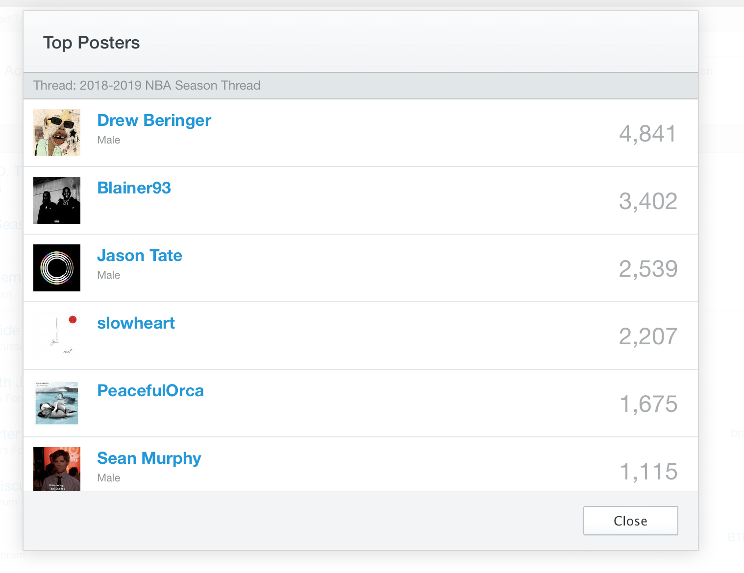
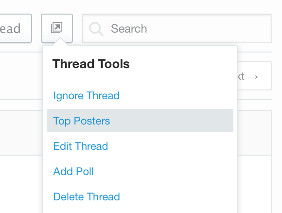
Today I’m excited to bring a new feature to the website for all users: Top Posters in a thread. This is a feature that I had written a long time ago on AbsolutePunk.net, but it didn’t get done in time to bring to this website … until now. This feature shows you who has posted the most in each thread and gives you quick access to all of the posts from each user in that thread.
It looks like this:
And you can access it in a variety of ways.
On a desktop computer you’ll find the option in the Thread Tools menu at the top of each thread (this is one reason I redesigned the thread view a few months back to give me a better way to add new features and options to each thread):
You can also click on the number of replies in any forum view:
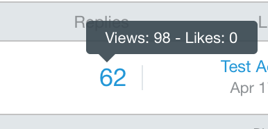
… and this will give you the same pop-up of the top posters from that thread. (This works via your Followed Threads list as well.)
On mobile you can find this via the action menu (top right icon) in any thread and then by clicking the Top Posters button from that menu. From the Top Posters pop-up page you’ll see who has posted the most in each thread and if click their username you can view their mini-profile, or if you click the number of posts they’ve made (the number on the right), you’ll run a search and see all of their posts in that thread. (This was always available by doing a search in a thread and typing in a username, but this is a faster way to find posts by a specific user in a thread.)
May 28, 2019
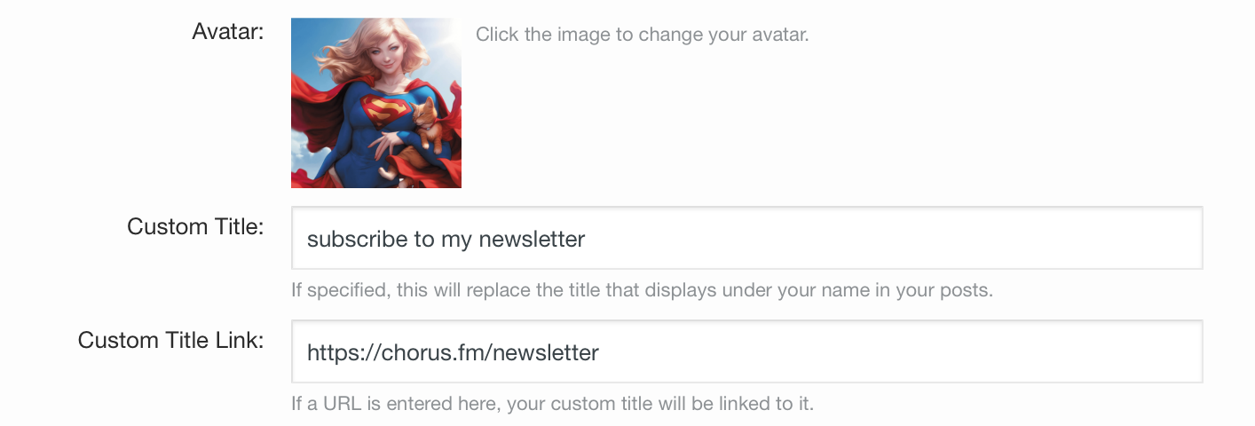
Today I’ve added a new feature for supporters where they can link their user title (the text that shows up under your username on your posts, in your mini-profile, and on your profile) to any URL they’d like. This is an often requested feature and a great way to plug your blog, bandcamp, twitter, podcast, or really anything you’d like. Supporters will find the new field to enter a URL on their Edit Profile page. Simple.
May 27, 2019
- I made a small change to the page navigation logic for mobile devices. A lot of people asked me why “2” didn’t show up in the page nav, and it was because of space concerns, and the duplicate with “next →” already being there, that I didn’t include it. I finally had some time to make it so that I could show the “2” on the first page of a thread AND still have enough space in the middle of threads to show pages next and previous pages on both sides as well. I think I caught everything and there shouldn’t be any bugs, and I doubt anyone actually even notices the change. But, it’s better now.
May 6, 2019
Today I’m rolling out one of my favorite new additions and features to the website in quite a while: post bookmarks. This is a supporter only feature for the time being.
Have you ever been recommended a band and want to make a note of it to check it out later? Has someone ever said something funny that you want to keep track of and be able to come back to? What about a movie recommendation, or a ridiculous prediction you want to remember in a few months? Or maybe you made a good point/funny comment yourself and you want to keep track of it for posterity? Now, with the bookmark feature, you can do just that.
On all posts on the website you’ll now find a new “bookmark” link that appears in the same place as “edit, delete, and report.” On desktop it’s in the left corner when you hover over a post, on mobile it appears when you tap the … menu link on any post.
Once you do that you’ll have the option to add a note if you’d like about the post. This is a good way to add some context for what you’re bookmarking to help jog your memory later.
You’ll find all your bookmarks on your Bookmark List page available via the pop-down menu on desktop via your username in the menu bar.
On the Bookmark List page you’ll see all of your bookmarks:
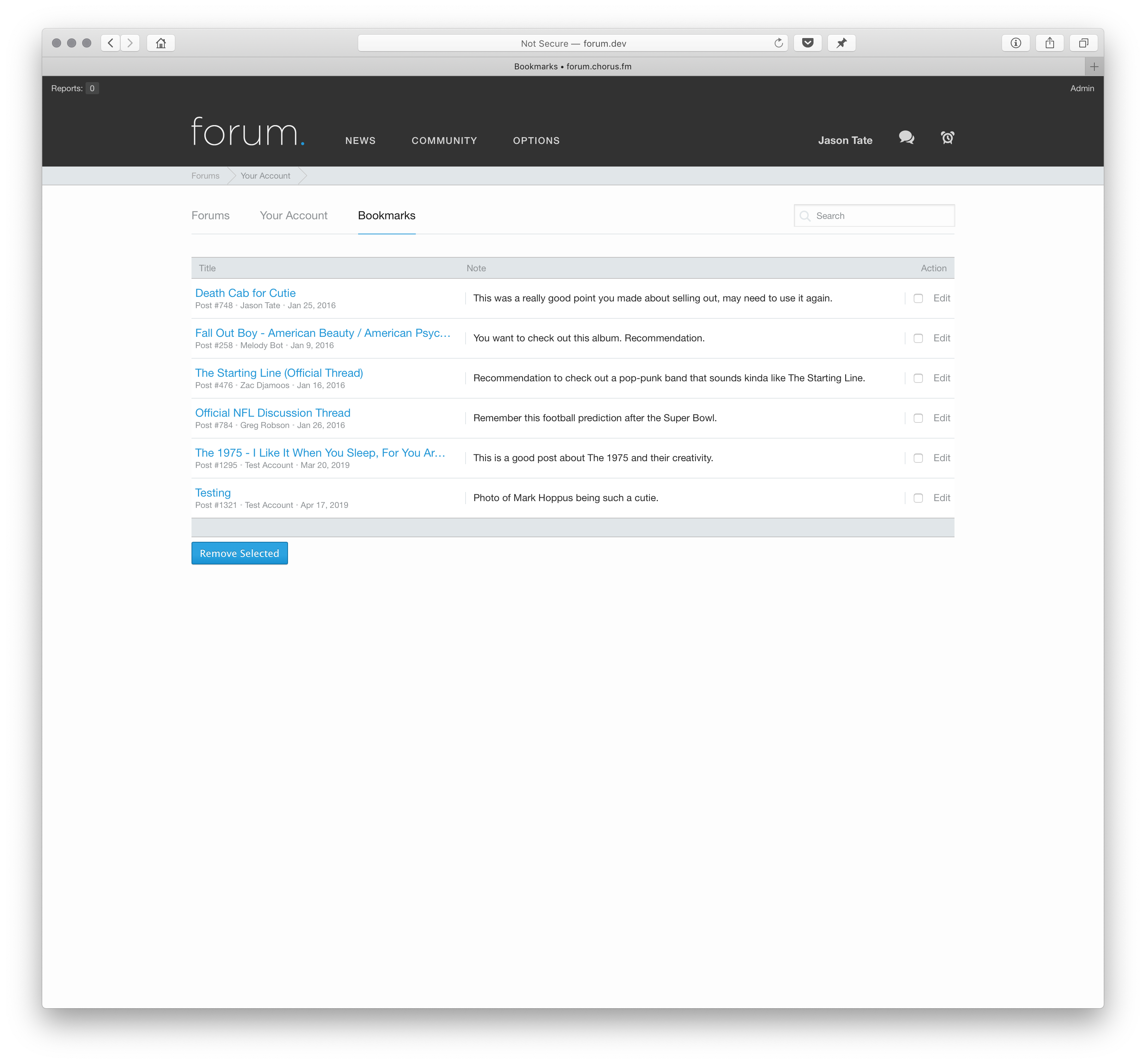
This page shows you the thread your bookmark was in, who the post was by, the date it was made on, and clicking the blue thread link will take you right to the bookmarked post. You also have all your notes for each post right there as well. You can edit your notes, or remove bookmarks, from here as well.
Lastly, I added a live instant search at the top of the page. This will search all your bookmarks for any word you’re looking for and show the matches. Here’s quick little screen capture I made showing it in practice.
You can search by post username, thread title, and all of your notes as well. So, for one example, you could add a specific word, like a tag, to any note, and then quickly filter for everything that contains the tag “rec.” This search box and feature also exists on mobile so all your bookmarks will always be with you and you can find what you’re looking for easily.
Last thing I can think of is that for right now this is a supporter only feature. It took a lot of time and effort to build, and it takes up website resources that need to be paid for in some fashion. If you ever decide not to be a supporter any longer, you’ll lose access to the bookmark feature but I will not delete your bookmarks. You can still access all of them when you become a supporter again.
April 8, 2019
- Launched the Chorus merch shop.
March 20, 2019
- Fixed a bug that would logout supporters after sessions ended, instead of keeping them logged in for a much longer period. (Sorry about that, it was a weird thing where it worked right with my account, but not with other accounts.) So, all supporters should now be able to login once and have that ‘stick’ for quite a while. (You’ll need to logout/and back in for the new cookie to set.)
- The second minor change is that when viewing videos on the homepage, the links to the videos now properly respond to keyboard shortcuts and clicks. So, for example, if you use Command+Click on a YouTube video link it will open up in a new tab behind the current one you’re viewing. Shift+Command+Click will open the link in a new foremost tab. Regular clicking will still open the video in the Lightbox view. This was something I wanted to fix for a long while, since a lot of people like to open up all the videos they wanna watch in the background while reading the news, and then go through them, instead of having the video take up the entire screen right then.
March 6, 2019
- Added Apple Music as an auto embed on the forum.
February 11, 2019
- Added some common keyboard shortcuts to a help page.
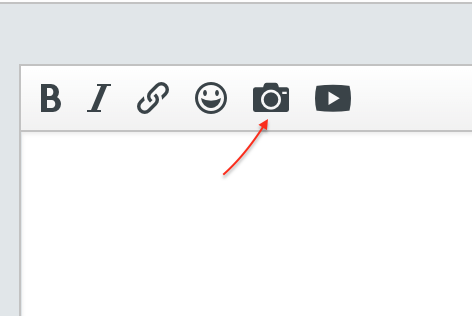
Today I’ve added Giphy support as a posting option in the forums. Giphy is a giant gif resource, and in the forums we post a lot of gifs. So, it makes sense to be able to quickly and easily find and post a gif when you want to. In the past this meant google, copy/paste, and all sorts of little hoops. Now, it’s just a simple search and tap.
(Also available on mobile via “More Options.”)
You will now see an option to search for a gif via Giphy. Click that and you’ll get a new dialog box where you can search for any gif you want. Search and hit return/click the search button … and you’ll get all the gifs from Giphy for that topic. Tap, or click, one, and it’ll be inserted into your post. Simple, fast, easy.
I’ve been testing the feature for a little while now, and rolled it out to supporters last week, and it’s been a whole lot of fun to play around with because it simplifies the entire process and avoids broken hotlinked images, weird upload failures, or images not quite embedding correctly when you want to insert one into a post.
If you’re on desktop, with a keyboard, you can also pop the gif search box up automatically using the keyboard shortcut Command (or control) + G. (All keyboard shortcuts require the cursor to be in the posting/reply box.)
January 17, 2019
- For supporters, in dark mode in the forum, the notification background for “new” notifications has been lightened a little bit. This makes it easier to tell what notifications are “new” and works better when the brightness on a device is turned low.
- I’ve added all of the members of a conversation to the conversation drop down menu on desktop. This way you can quickly see not only who replied last, but who that conversation was with. This was requested by people that had a lot of similar PM titles and wanted a quick way to be able to see what conversation was with whom.
- I also fixed up how commas after usernames were displayed when there were multiple people in a conversation in the inbox. And, on mobile, I added the same list of all conversation participants to the inbox view to, again, make it easier to find the conversation you’re looking for.
- I tweaked a few spacing issues on mobile threadbits because I think it looks better.
January 4, 2019
Today I’m happy to roll out a new feature on the website for all members: thread ignoring. This has been an often requested feature from a variety of members for a variety of reasons. To do this right, I needed to make a few other improvements to the forum as well, so here’s how everything works:
At the top of threads you will find a new “action button” between the “follow” button and search box. This button is where you’ll find a new item that will allow you to ignore (and unignore) threads. If you are the thread creator, or a moderator, this is also where you’ll find the thread tools that used to be accessible via the gear icon next to the thread title. This action button uses the same iconography that you will find on the mobile version of the website in the upper right corner of every page. On mobile, on any thread you will find all thread options, like following or unfollowing a thread, as well as ignoring or unignoring the thread, via this same action menu. (This addition of the action menu on the desktop site will allow me to add new thread options or features in the future as well. It’ll end up being the home to far more than just this feature.)

When you ignore a thread it will be added to your “ignored threads” list. To see what threads you’ve ignored, and to quickly unignore them, you can view this page via the control panel. On the desktop you can click your username at the top of the page and the option is in this menu (as well as the quick menu at the bottom of the page). If you are viewing your account settings you will also find the link to this page on the left side menu under “followed threads.” On mobile this page can be accessed via the forum menu (top left) and by then clicking “options.” It is the last item under that sub-menu.
When you ignore a thread it will no longer show up when you are browsing the forum listings, or in “Recent Activity,” or “Friend Feeds.” This includes actions in the thread, so, for example: if someone likes a post in a thread you are ignoring, it will not show up in “Recent Activity” for you as long as you are logged into the website. When you ignore a thread it will also automatically unfollow that thread if you are following it, and remove any notifications you may have set for the thread. At that time it’ll also black out every post in the thread, and display a message at the top, and bottom, of the thread letting you know you’re ignoring the thread. That way if you happen to come across the thread by accident, you’re not tempted to read it without first unignoring it. At this point in time, posts from ignored threads will still show up in search results and you will see users posts in ignored threads if you click to see all of their posts from their profile or mini-profile. (You can also still technically reply to ignored threads, but, obviously that doesn’t make a lot of sense to do.)
The main goal of this new system is to make it so that if you don’t want to see a thread being bumped up the forum list, you won’t. And if you didn’t want to see it show up in different feeds, you wouldn’t. Along with that I wanted to aid those that don’t want to see a thread in being able to have some help in avoiding it. I think these additional features are a big first step in that direction and I tried to error on the side of making it easy to use, but not so easy to just visit/read an ignored thread that it defeated the purpose for those that asked for a little extra help with self-control. I’ll continue to evaluate and adjust as needed.
I’ve also cleaned up a few aesthetic things that were bugging me when dealing with menus around the site. If you notice them, you’ve got an incredible eye.
November 28, 2018
- Minor bug fixes. And I fixed up few things I missed with the recent blocking system changes (blocked members won’t show up in received likes and will be better hidden other places now).
- Added a place for Discogs links on profiles and mini-profiles.
November 20, 2018
- I added a couple of keyboard shortcuts to make posting easier. When you’re within a posting box, you can use Command or CTRL+J to quickly submit a post. Some people like this more than the regular Tab+Enter (which, for reasons I can’t discern, doesn’t work on iPads). This works on almost every device with a keyboard I tested it on, but it needs to be “control+j” on an iPad with external keyboard. (I don’t know why “command” won’t work.)
- Command or CTRL + K will give you the link pop-up on desktop versions of the site.
November 9, 2018
- Implemented new ad changes.
October 29, 2018
- When a supporter selects the Dark Mode theme in their preferences, it will now automatically set the main website’s theme to Dark Mode as well. These are now better tied together, so if you select Light Mode in the forum the main website will also switch to Light Mode.
- When a supporter logs in via the main website, or logs in on the forum, ads will also now be automatically removed from the main website. (They’ve always been auto removed from the forums.) I will leave the preference to “turn off ads” in preferences for supporters for a while to make sure I didn’t screw anything up, but it should be automatic going forward.
October 15, 2018
I’ve added a few new social profiles that you can link up in the “about/contact” section of user profiles. You can edit these in the “contact details” admin panel and you now link up:
- Apple Music
- Trackt
- Goodreads
- Untappd
- Nintendo Friend Code
These show up on the “about” section of your profile and follow your privacy settings.
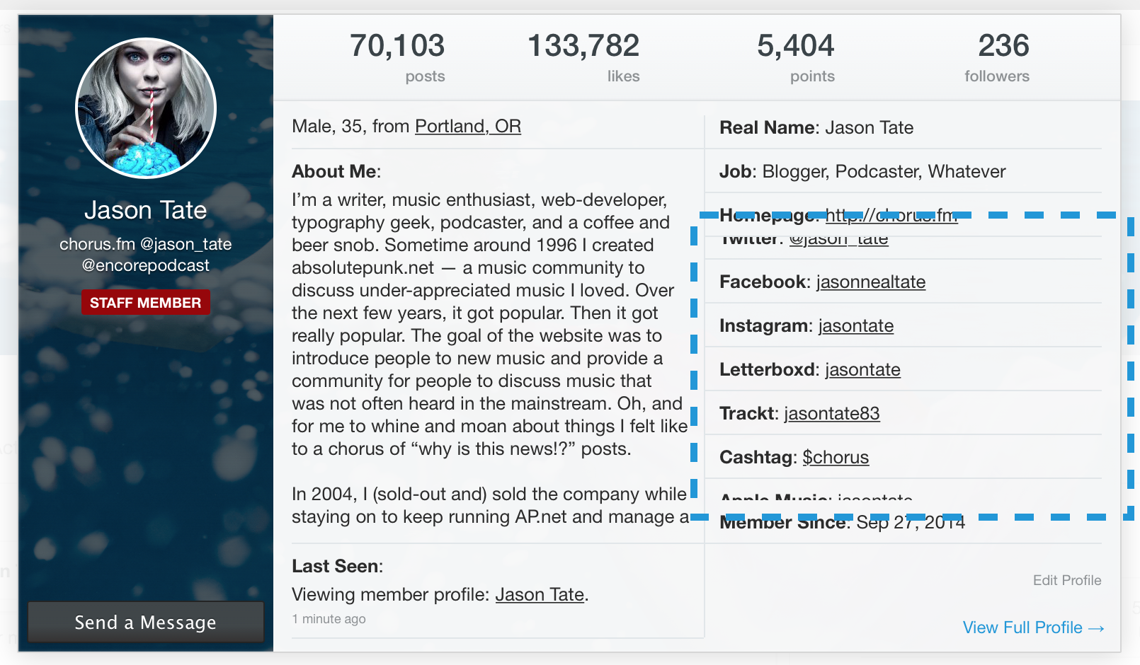
They also appear in your mini-profile on the desktop, and that also follows your privacy settings. I’ve expanded the mini-profile to include all of these instead of just a select few. So, if someone has a lot filled out, they will be scrollable, as highlighted here:
September 26, 2018
- I’ve removed TypeKit from the website. There were issues with the service and speed of the website and I’d rather have as few external javascript embeds as possible.
August 14, 2018
- Upgraded to the native Apple News format.
July 18, 2018
- I had a few people ask me if they could “turn off” the blue supporter badge that shows on profiles, mini-profiles, and posts on the website. They wanted to support the website, but felt like it was showing off to have the badge when they were posting around the website with friends. I totally get that, and so I’ve made it an option now to display the supporter badge if you’re a supporter. You’ll find this option in the supporter options section of your preferences page.
- A relatively minor update, but I made it so all categories of emoji/smilies are available via quick reply on desktop. Previously, you could only access the “extra” categories via the More Options page. Now, when you click the smilies button via Quick Reply you’ll also see the additional tabbed categories. As always, you can also find the full list of smilies here, along with all the shortcodes you type to use them.
July 17, 2018
- Made a few minor adjustments to the avatar selection screen so it is less confusing and looks better on mobile devices.
July 16, 2018
I’ve enabled and stylized a new notices system for the website that I may use in the future for various things. We already have a notification system that can send alerts to users, as well as the private messaging system, but I wanted to also have a way to display customized notices to different users based on different criteria. For example, I could show a notice to members once they move from being a “newbie” to a “trusted” user and let them know that they can create new threads now. Or, promote our “account upgrade” options to members after they’ve been on the website for a year. Or to let the entire forum know about something important. (I’ll probably be using this in the future when there will be scheduled maintenance on the servers, instead of just posting a thread in this forum — which most people never see — so people know when the website will be down.) There’s quite a few ways I can think to use these in the future.
There’s a few different ways these notices will display. The first, is at the top of pages:
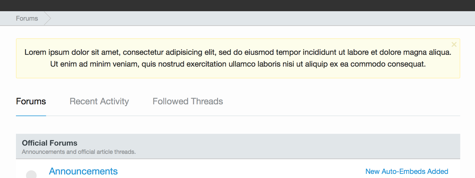
This is a basic notice. Note, these notices can be dismissed:
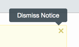
There’s a little X in the top right corner. Clicking it will make the notice go away. I don’t want the notices to be annoying, but instead a way to alert users to some kind of information. So, once you’ve seen it, there’s no reason for it to stay on your screen. And if there are multiple notices to display, it can rotate through them with little tab links to the other notices underneath the main box.
Along with this, I can also display little floating notices. Similar to the floating notification messages that appear in the bottom left corner of your screen when someone quotes you, or sends you a message.

I am not quite sure what I would use this version for yet, but, it’s an option available to me now if needed in the future. (These are also dismissible.)
I haven’t decided when/where/what the first notices will be (probably something for unregistered users suggesting that they sign up!), but I wanted to let everyone know what they are so when you see one you aren’t freaked out.
July 11, 2018
I made some mini-profile changes on the mobile website. The mini-profile (what you see when you click on a username on the website) is one of my favorite features on the website. I think it’s great on the desktop to get a quick look at a user’s profile and see information about them. When I originally designed this site I wanted to do more with the mini-profile on mobile, but ran out of time to do all the responsive changes I had envisioned. I have now gone back to make those changes. The mini-profile now displays far more information on mobile to give you a great, quick, look at a member. You can now see their post count (taping on this will take you to a user’s posts), like count, and follower count. You can also see their bio line (if you have permission to view it) showing gender, age, and location. I’ve also added the “last seen” bar as well so you can see when a user was last on the website, and if they’re on the website right now, what they’re currently viewing. And, lastly, I’ve made the block button more visible. This goes hand in hand with my recent “blocking changes” to make it easier for someone to block a user they don’t want to see on the website. The button is now far easier to access and find via the mobile mini-profile.
I also tweaked how supporter cover photos are shown. I basically stole this from Twitter. This allows the mini-profile on mobile to be easy to read even if a user has a cover photo and it’s light. Before, this took over the entire mini-profile and sometimes made things harder to read. I kept the avatar at the same size and shape that it’s viewed on desktop, so that when you’re on mobile you can click a username and see a bigger version of the avatar in better detail.
I think this is a massive improvement to the mobile website. (It also works in Dark Mode.)
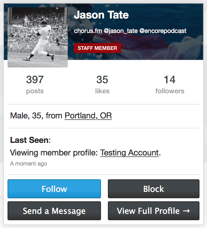
I still may make a few tweaks/changes as I play around with it on the live website and search for any edge cases or bugs.
July 9, 2018
- I swapped out “friend feed” at the top of the forum navigation tab bar to instead be “recent activity” — which matches all the other tab bar pages. Recent activity is more used, more accessed, and I thought it made the most sense to have these three tabs be consistent across the website. It was a little confusing and weird that I changed them depending on where you were on the site. The friend feed is still accessible via the menu at the top of the screen (click your username) or via the side menu on mobile.
- I also added “recent activity” to the side menu on mobile. It is now under “friend feed” for easy access. Now, when you’re on any page on mobile you can access the recent activity feed to see what other conversations are going on around the website.
- On the mobile side menu I’ve also tweaked a few things to make it easier to use. I put all of the “preferences” under a new collapsable menu called “options.” Clicking options will expand a sub-menu with “edit profile,” “contact details,” “privacy,” “following,” “blocking,” “password change,” “preferences.” and “notification settings.” Instead of all these options taking up lots of space in the menu, they’re now collapsed until you need them. This allows me to add new options to the side bar when needed, and to keep that menu cleaner when you open it to navigate around the site.
- A couple minor bug fixes to clean up some cosmetic things for logged out users.
July 3, 2018
Ok, after listening to feedback and re-thinking some things, I’ve spent some time under the hood to re-write the blocking system on the website. This post will outline the changes I’ve made and how they impact the people you block on the website.
Reminder: You can block a user by clicking their username and clicking “block” on the mini profile. You can also view their full profile and click “block.” You can find every user you are blocking, and add users to your block list, via the blocking page. This page can be found via the side menu on mobile, or via the menu when you click your username on the desktop.
Here’s what happens when you block a member now:
- If you are following them, you will un-follow them immediately.
- You will no longer be able to view their profile or their mini-profile. This will help avoid the temptation to find the posts of people you’ve blocked.
- All of their posts will be removed from the website for you (including profile posts). When you’re logged in you will no longer be able to see their posts on the website. I’ve tweaked a few things to make this work even better and have the posts more transparently disappear from the flow of reading the website. This includes all feeds.
- You will no longer see their “likes” on any posts.
- You will get no notifications from them.
- You will no longer see any private messages they send you. They will simply not show up in your message inbox. You will also not be able to send private messages to them.
- Any private message you have in your inbox from a blocked user already will remain, in case you need it for your records. The blocked member can still add new messages to that conversation thread. However, if you click “leave conversation and ignore future messages” that message will be gone and they will no longer be able to contact you.
- You will not see any blocked user’s posts in “quotes” from other members.
- The blocked member will no longer show up in @replies auto complete.
- Basically, to you, the blocked member will cease to exist on the website. Poof. The only time you’ll notice anything different is that on the thread and forum view, under “last post,” if the very last post in a thread is from a blocked member it’ll say “Blocked Member” and if you go to the very last page, and there’s zero posts on that page from anyone that you have not blocked, you’ll see a little notification that lets you know you’re blocking the posts on that page. That only shows up if the entire page of posts is from blocked users, just so you don’t think the website is broken.
I think overall this is a massive improvement to the blocking system on the website and allows users to better decide who they want to see posting on the website and who they would rather not run into. By tweaking a few things to make the entire system “erase” the blocked member from around the website it also gives you a peace of mind you won’t see a name in the “likes” or feel tempted to view their profile and do some stalking. Heh.
Along with this, I’ve also made the decision to allow all members of the website the ability to block my account. In the past I had stopped this from happening so that I could give warnings to people and I would know they would see them. However, I also realize that at times my shit-posting or sarcastic comments are very annoying. Now, if you block my account and I do give you a warning, or try and reach out to you, you won’t see it … so, that’s one of the risks you’ll take. So, be aware of that. You won’t get any messages from me, privately, or publicly. Since the news posts come from Melody Bot, and most of the official “warnings” for infractions also come from Melody Bot, this hopefully will have a minimal impact on the moderating/actual website usage. At the very least we’re going to give it a shot for a little while and see what happens.
If you have any questions or comments, please let me know. I think I’ve got to everything and thought through everything, but I may have missed something.
Ok, that was a lot of coding over the past week, so I need a beer and some dinner.
June 18, 2018
When quoting long blocks of text in the forum, I like to use the “blockquote.” I think this looks better than the regular “quote” (which I think works best for quoting other users on the website), but when I’m just quoting something from an article, then the blockquote is far more useful and I think looks and reads better:

This has always been possible using the [bq]text here[/bq] bbcode, but I’ve now added this option to the editor menu as well. You can find this using the “more” pull down menu on the “more options” version of a post.
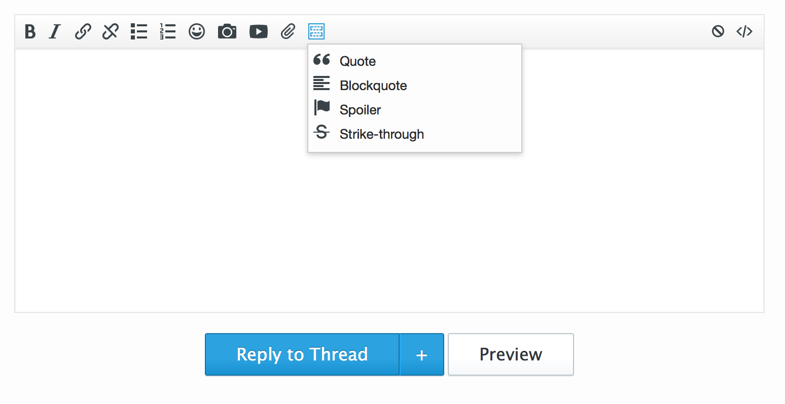
You can highlight a block of text and select it, or select it and then copy/paste text between the bbcode. Figured this may make it easier for more people to use the blockquote, which, is just better for long blocks of text and looks great.
April 18, 2018
Added to each of the forums a new “policy/guidance” post to outline a few different policies about each forum:
- General Forum Policies and Guidance
- Music Forum Policies and Guidance
- Entertainment Forum Policies and Guidance
- Technology Forum Policies and Guidance
- Sports Forum Policies and Guidance
- Politics Forum Policies and Guidance
These can then be updated in the future by moderators to help clarify specific policies, rules, or informal rules about each forum to help maintain a cleaner and clearer list of policies if/when they may differ between different forums.
I also cleaned up the pinned/sticky thread situation in all of the forums. The goal is to have a minimal amount of pinned threads in each forum so that new discussions can bubble to the top and be easier for new (and long time) visitors. A few forums have more than others (like the sports forum) but I think we had too many in most of the forums and everything will run smoother this way. This thread being in every single forum now gives people a place they can check to see forum policies and quickly access the rules and code of conduct as well. Plus, the thread can be a place to discuss new policies, formal and not, for each forum with moderators and other members to talk about formatting, informal/formal rules, and things like that.
There’s also quick links to all the prefixes in each forum that are available and some common threads that are important and worth highlighting.
April 16, 2018
April 11, 2018
- Following the past couple of days and smilie additions, today I’m adding some MLB teams to our sports section for all posting options. (Click more options, click the smilie face on the toolbar, select sports.)
- In time for the NBA playoffs, I give you … team emoji. You’ll find the logos for all thirty NBA teams in the smilie section on all posting forms. (Click more options, click the smilie face on the toolbar, select sports.) You can also find them on the smilies documentation page. This page also lists all the text codes you can use while posting to insert smilies into your post include the shortcodes for each of the team logos (most are the full team name or the nickname for the team).
April 9, 2018
- New smilies. I have added over 70 new smilies into the website for your posting joy. Most of the new smilies can be found in the “extra” category. (Click ‘more options’ from any posting place and then click the smile on the toolbar to see all the smilie categories.) Also, there are a variety of smilies that are “hidden” or secret, and you can find them on the smilies documentation page. This page also lists all the text codes you can use while posting to insert smilies into your post. Enjoy new smilies, faces, food, animals, objects and more.
April 6, 2018
- Small update to the recent activity/news feed section of the website to include smilies when viewing the pages. Before it would show the text rendition, but I think using the actual image/smilie just looks better. So, now it shows the image instead.
March 29, 2018
I’ve added some enhancements to search around the website. On desktop, when you are visiting a specific forum and you click the search box in the upper right there’s now a checkbox (defaulted to checked) that will make sure your search only runs in the forum you’re currently viewing.
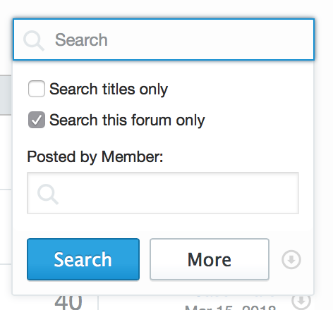
This is usually what someone wants when they are searching in a specific forum, they’re looking for either a post or a thread in that forum. However, if you’d like to search the entire site you can simply uncheck this box and the search will search the entire website. (You can also click More to go to the advanced search page with lot of different options for narrowing your search.)
This advanced search page was hidden on mobile before, however, I have added it to the action menu on all pages where it makes sense. (The action menu is the button in the upper right of the mobile view), clicking it now will give you a button for “advanced search” on the forums and in threads. This will allow you to do some more advanced searching to find exactly what you are looking for while on mobile. Search specific forums, search titles only, and perform “search by member” searches as well.
All in all, some smaller updates, but I think they will make the website better and searching even easier.
March 6th, 2018
Today I’ve made it much easier to do more advanced posting via mobile. Adding images, smilies, and attachments to posts is now available via the “more options” screen everywhere you can make posts.
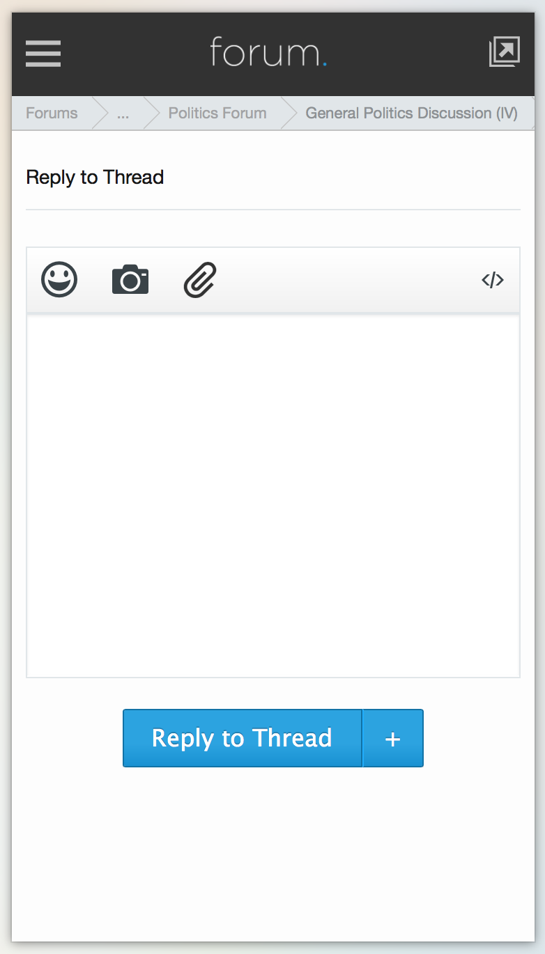
From here I’ve added big tap targets for smilies, inserting an image, and adding attachments. These options were originally hidden on this screen unless you turned your phone sideways into landscape mode. Now, they’re available in portrait mode.
The insert an image button (the camera) will allow you to paste any image URL into the box and insert it into your post with ease.
The smilie button will give you access to all the smilies/emoji we have on the website that can be inserted into your post (it appears below the posting box).
The insert attachment button (the paperclip) will allow you to upload and insert any image you have on your phone or tablet into your post. (I’ve only tested this with iPhones and iPads, but it should work with Android devices.) Once your image has been uploaded to your post, you can insert it into your post using the buttons below the posting area. (Just like on the desktop, you’ll have the option of inserting the full image or a small thumbnail version of your attachment.)
December 18, 2017
Forum members must be registered at least three days and have at least 20 posts before they can create a thread. This is to help avoid spam or people creating accounts just to make threads / self-promote.
December 11, 2017
- Brought Dark Mode to the main website for supporters.
December 1, 2017
- Bridged the supporter systems between the main website and the forum so that members could login and not see ads and build the foundation for dark mode on the main website.
June 8, 2017
- Launched Chorus 2.0.
February 10, 2017
- Expanded our supporter tiers.
September 13, 2016
- A polls forum has been added as a sub-forum off the general forum. This forum is for the creation of polls and voting in others. The goal is to clean up the general forum from being overrun with polls.
August 11, 2016
- Ok, I think I fixed a few of the Twitter issues with embeds throwing off jumping to specific posts in a thread. It can’t really be, perfect, with how embedding from Twitter works, but I think I was able to get it pretty damn close. There may be a few times where Tweets get cut off, but rolling the mouse over it should fix it / touching it on iOS. I’ve been playing with it a lot over the past few days in the politics thread where I’ve been posting a looot of Tweets to see if I can break it/tweak it to get it to work right. I think it’s about as good as it can be now.
May 19, 2016
- The new Chorus logo is unveiled.
April 15, 2016
- Little minor addition to search results on the main site. If you’re searching for something that has a tag page, now I return a little prompt to point you toward that page since it’s a much better landing page for specific topics than a list of search results. Like if you’re looking for “Brand New,” hitting their tag page is probably what you want more than every post that has the words “brand new” in them on the site.
April 12, 2016
- I re-did how articles display in the discussion forum to pull in more of the article and allow expansion and (hopefully) better formatting. I also re-configured the news submission system to better filter spam. I also added a variety of other social accounts in the contact details section of the profile. Lastly, I changed the break point so iPhone 5 size screens should be able to access mobile attachments in landscape mode via “more options” (plan is to increase those button sizes on mobile devices soon).
April 10, 2016
- There is now a retrospective tag for certain reviews. Few minor bug fixes.
April 6, 2016
- I updated the font on release dates and tour dates to be more readable on non-retina screens.
April 3, 2016
- Given that it was by far the most requested feature since launch. I’ve finished and rolled out the code that links articles on the main site with their forum threads. There are now little icons on each article that link to their respective forum thread. Examples.
April 1st, 2016
- Launched Chorus 1.0 to the world. (Archive screenshot.)
March 21, 2016
- Small change made today to serve the forums securely using SSL/HTTPS. Now all forum traffic should be redirected to the https versions and properly encrypted.
March 13, 2016
- Quick little change to fill in the “heart” on a liked post. I found that I kept “re-liking” a post I had already liked because I didn’t read fast enough or see that I had already liked a post. I think this, especially on mobile, helps with that.
March 11, 2016
- Added the ability to drag attachments to quick reply to upload them. This also works on the main / “more options” posting window for adding attachments (or multiple attachments.)
January 18, 2016
One of the last features I wanted to build into the beta version of this forum before it was ready for launch (aside from all the bug fixes I know will be found) was a cover photo feature. I like how this works on Facebook and Twitter and it gives profiles a nice customization and personal feel. (I also worked them into the mini-profiles.) Since these are large images (especially for retina screens), and I’m not sure how well the feature will scale with more users, I am making this a supporter perk for the time being. I may change that at some point after seeing how the website handles traffic and load times and all of that.
- Cover photos can be uploaded via edit profile.
- It is recommended that a large image is used in the same way you would a wallpaper. Images that cover the whole area just look better on all screens than those that only take up a small corner.
- I’d recommend playing around in an image editor (Gimp, Pixelmator, or Acorn are all good) to make the image somewhere around 2024 pixels wide by 600 high. This will keep the image relatively sharp even on retina screens. If you don’t have an image editor handy, give Landcape a try. Upload your image, set a custom size (2024×600 works well), and then move, crop, and zoom in or out on your image until you like how it looks.
- There’s a 2 MB max file size limit. (I export as a JPG and run it through the free ImageOptim to keep the filesize low.)
- Currently the system allows you to replace your cover photo, but if you end up wanting to delete the cover photo and not have one at all, please just message me and I can take care of that.
- If you upload a new image and it’s not showing, make sure you do a hard refresh to clear your cache.
January 9, 2016
September 27, 2014
- I created my account on a new domain, installed Xenforo and WordPress, and started playing around with the idea of what the next version of a community and blog could look like.